

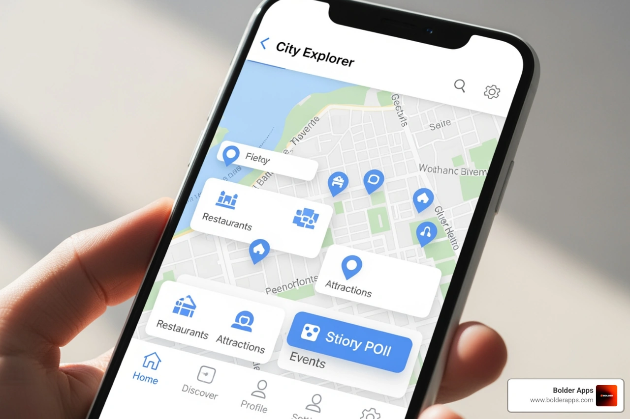
Why Intuitive UI UX Design Matters More Than Ever
Intuitive UI UX is a design approach that makes digital products feel effortless. Users understand what to do next without thinking, reading instructions, or getting frustrated. An intuitive interface is defined by a low cognitive load, alignment with user expectations (mental models), a clear visual hierarchy, immediate feedback, and consistent design patterns.
Why does it matter? The business impact is enormous. Intuitive design can:
- Boost conversion rates by up to 200%
- Significantly reduce customer support costs
- Increase user retention and satisfaction
- Deliver an ROI of up to $100 for every $1 invested in UX
Think about the last time you used an app that just worked. You probably didn't notice the design; you simply completed your task and moved on. That's the goal. The opposite—a confusing checkout flow or hidden menus—creates friction that costs real money. With the average user's attention span at just over 8 seconds, they won't stick around to figure out a clunky interface.
The difference isn't magic. It's the result of understanding how people think and removing every obstacle between them and their goal. This guide breaks down how to create those seamless experiences. We'll explore the psychology, core principles, and practical steps to design products users love—no manual required.

The "Why" Behind Intuition: Understanding the User's Mind
At Bolder Apps, we believe the heart of a successful digital product is its ability to connect with users on a subconscious level. This connection, known as intuitive UI UX, is a critical driver of business success. When an interface feels natural, users focus on their tasks, not the tool. This reduces friction, deepens engagement, and turns satisfied users into loyal customers.
The importance of intuitive design is rooted in human psychology. We prefer simplicity, and this extends to our digital interactions. An easy-to-steer product is one that gets used, leading to higher satisfaction and retention. The business case is just as strong. A Forrester study revealed a staggering return of $100 for every $1 invested in UI/UX design. Conversely, bad UX is costly; one study found that 88% of online customers are less likely to return to a site after a bad experience. Prioritizing intuitive UI UX is about designing for efficiency, satisfaction, and profitability.

What is a User's Mental Model?
To design an intuitive UI UX, we must understand a user's mental model—their internal representation of how something works. This model is built from past experiences, cultural norms, and pre-existing expectations. For example, we expect a button to be pressable and to trigger a reaction. If a digital element looks like a button but doesn't act like one, it breaks this mental model, causing confusion. A design that misaligns with a user's mental model forces them into problem-solving mode, increasing their mental effort, or cognitive load. Our goal is to align our interface with these models to make interactions feel effortless.
How Cognitive Load Impacts Intuitive UI UX
Cognitive load is the mental effort required to complete a task. Intuitive interfaces have a low cognitive load. High cognitive load, caused by unclear navigation, information overload, or visual clutter, leads to frustration. Intuitive design simplifies three main types of complexity:
- Cognitive Complexity: Arises from overwhelming layouts and too many choices.
- Visual Complexity: Refers to visual clutter and a lack of clear hierarchy.
- Interaction Complexity: Stems from convoluted workflows and unclear actions.
Hick's Law is a key principle here: the more choices a user has, the longer it takes to decide. Great intuitive UI UX limits options at each step, making the path forward clear. With user attention spans shrinking, an interface that makes users think too hard will quickly be abandoned.
Key Psychological Concepts in Design
Several psychological concepts underpin intuitive UI UX:
- Peak-End Rule: People judge an experience on its most intense point (peak) and its end. We ensure critical moments, like a purchase confirmation, are positive and memorable.
- Aesthetic-Usability Effect: Users perceive beautiful designs as more usable. A visually appealing interface creates a positive impression and can make users more forgiving of minor flaws.
- Von Restorff Effect (Isolation Effect): An object that stands out from similar objects is more likely to be remembered. We use this to make primary calls-to-action visually distinct.
- Storytelling Effect: Humans are wired for stories. Crafting user journeys as a narrative makes complex processes more engaging and easier to follow.
- Curiosity Gap: People are motivated to learn when there's a gap between what they know and what they want to know. Intriguing teasers can encourage users to explore further.
These insights help us create experiences that resonate. For more on how we translate these principles into design, consider our Prototype Development Services.
The Core Principles of Building an Intuitive UI UX
Building an intuitive UI UX relies on a combination of foundational principles. At Bolder Apps, we use these elements to craft interfaces that "just work" by focusing on simplicity, consistency, feedback, and accessibility.

Simplicity and Consistency: The Twin Pillars of Clarity
Simplicity in intuitive UI UX means clarity, not a lack of features. It's about minimizing cognitive load by removing unnecessary elements and focusing on the essential. As UX experts often warn, every piece of information competes for the user's attention. We aim for a straightforward layout where the next step is always clear.
Consistency is the unsung hero of intuitive design. It ensures similar elements look and behave in similar ways across the entire product. This includes consistent typography, colors, and placement of common UI elements like navigation bars. Consistency helps users build accurate mental models quickly, reducing the learning curve and building their confidence.
A useful technique is the Squint Test. By squinting at your design, you blur the details. If the most important elements (like calls to action) still stand out, your visual hierarchy is strong. If it's a jumbled mess, it's time to simplify. This test helps streamline visual elements for maximum clarity.
Feedback, Affordance, and Forgiveness
Feedback is crucial for an intuitive UI UX. Users need immediate confirmation that their actions were successful. A visual change, loading spinner, or success message provides reassurance and builds trust.
Affordances are visual clues that suggest how an element can be used. A button should look clickable, and a "+" icon should intuitively mean "add." These cues leverage our understanding of real-world objects, so users don't have to guess what will happen.
Forgiveness allows users to make mistakes without severe consequences. An intuitive design provides easy ways to recover, such as "undo" options or confirmation dialogs for destructive actions (like deleting a file). This makes users feel safe to explore, knowing they can easily backtrack.
Why Accessibility is Non-Negotiable for Intuitive Design
Accessibility is a fundamental component of intuitive UI UX, not an afterthought. It's about simplifying for all users, regardless of ability. Designing for accessibility from the start ensures products are usable by the widest possible audience.
According to the World Health Organization, 1.6 billion people globally experience significant disability. This is a massive segment of users who deserve equitable access. Integrating accessibility means:
- Inclusive Design: Considering diverse user needs from the beginning.
- Adhering to Guidelines: Following standards like WCAG for color contrast, keyboard navigation, and screen reader compatibility.
- Clear Information: Ensuring all interactive elements are clearly labeled.
- Flexible Inputs: Supporting various input methods, like keyboard or voice commands.
Designing for accessibility often creates a better experience for everyone. For example, good color contrast benefits all users. This commitment to inclusive design is core to our philosophy at Bolder Apps. For a comprehensive view on building accessible apps, explore our insights on the Mobile App Development Process in 2026.
From Theory to Practice: A Step-by-Step Design Process
Creating an intuitive UI UX is a systematic process, not a mystical art. At Bolder Apps, we follow an iterative approach that moves from deep user understanding to design, testing, and continuous refinement.
Step 1: Understanding Your User's World
The first step is to understand the user. We need to know who they are, their goals, and their previous experiences. Effective methods for understanding user mental models include:
- User Interviews: One-on-one conversations to uncover motivations and pain points.
- Surveys: To gather quantitative data and identify common trends.
- Contextual Inquiry: Observing users in their natural environment to see real-world behaviors.
- Persona Creation: Developing fictional representations of target users to guide design decisions.
- Empathy Maps: Visualizing what users say, think, do, and feel to build empathy.
This foundational research is crucial for designing an interface that aligns with user expectations and reduces cognitive load. For insights into future-forward approaches to user understanding, consider exploring The Rise of Vibe Codable UI: Why the Future of UX is Reprogrammable by Chat.
Step 2: Applying Practical Design Techniques
With user insights in hand, we apply practical techniques to build an intuitive UI UX:
- Law of Locality: Place related controls and information close to each other. For example, an "Add to Cart" button should be near the product's price. This minimizes mental effort.
- Dropdown Alternatives: Dropdowns hide options and increase cognitive load. When possible, use more visible alternatives like radio buttons, segmented controls, steppers, or autocomplete fields.
- Teaching by Example: Instead of long tutorials, show users how a feature works with interactive demos or pre-filled example data. This passive guidance makes new features more approachable.
- Visual Cues & Progressive Disclosure: Use subtle visual hints and reveal information only when needed. This keeps the interface clean while ensuring necessary details are accessible.
These techniques help us stay at the forefront of design. For a glimpse into how future technologies might redefine UI, dig into Beyond Static Screens: Using Google's 2026 AI Breakthroughs to Build Generative UI in Your App.
Step 3: Testing, Iterating, and Refining Your Intuitive UI UX
Testing is a non-negotiable step. We can't know how users will react until they use the product.
- Usability Testing: We observe real users attempting to complete tasks, asking them to "think aloud" to reveal their mental processes and identify confusion. Integrating usability testing has been shown to dramatically reduce customer support costs—in some cases by up to 90%.
- A/B Testing: This data-driven approach allows us to compare two versions of a UI element to see which performs better in a live environment.
- Gathering Feedback: We use in-app surveys and feedback forms to create a channel for continuous user input.
- Continuous Improvement: The design process is never "finished." We accept an iterative approach, constantly refining the intuitive UI UX based on data and user feedback.
Real-World Examples and Common Challenges
When we talk about intuitive UI UX, it's helpful to look at both real-world applications and the inherent challenges designers face. What does great intuitive design look like in practice, and what are its limitations?
What Great Intuitive Design Looks Like
Great intuitive UI UX often goes unnoticed because it allows users to achieve their goals effortlessly. Here are some examples of industries and app types that often exhibit strong intuitive design:
- Modern Language Learning Apps: Many excel at building habits with emotionally intelligent UI/UX. Their interfaces are often light and fun, keeping users engaged with game-like mechanics that make learning feel less like a chore.
- Cloud Storage and File-Sharing Services: These services typically prioritize simplicity with clear language, visuals illustrating use cases, and straightforward calls to action.
- Video Streaming Platforms: The best platforms offer a clean, simple sign-up process and a seamless user experience with personalized recommendations and easy navigation.
- Productivity and Note-Taking Apps: Top-tier apps balance deep customization with simplicity, using templates and tooltips to guide users through complex features without creating chaos.
- Leading Smartphone Ecosystems: The most popular mobile operating systems are highly acclaimed for their user-friendly interfaces. Their touch gestures, iconography, and overall aesthetic align with user preconceptions, creating a highly intuitive experience.
Characteristics of a great intuitive interface include:
- Findability: Users can easily find what they need, like a prominent message box in a chat app.
- Affordance: Visual cues clearly indicate how UI elements can be used.
- Expectation: UI elements behave as users predict.
- Efficiency: Users can perform actions with minimal effort, like using keyboard shortcuts to complete an action.
- Responsiveness: Immediate feedback is provided for user actions, which reassures users that their input was received and prevents uncertainty.
- Forgiveness: Users can make mistakes and recover easily, such as through an "undo" function or smart spelling correction in a search bar.
- Explorability: Features are organized in a navigable way that encourages findy.
- Zero Frustration: All these principles combine to ensure user satisfaction.
The Inevitable Problems: Limitations of Intuitive Design
Despite our best efforts, achieving a universally intuitive UI UX is challenging.
- User Diversity & Subjectivity: What's intuitive to one person may be confusing to another. Intuition is highly subjective and depends on a user's background and prior experience.
- Cultural Differences: An icon or metaphor that is intuitive in one culture might be meaningless in another. Designing for a global audience requires careful consideration of these variances.
- Evolving Expectations: User expectations are not static. As technology advances and users become accustomed to new interaction patterns (like gestures or voice control), the bar for intuitiveness constantly rises.
- Balancing Simplicity and Functionality: For complex products, over-simplification can hinder advanced users. The challenge is to make core functionality intuitive for all while still providing powerful features for those who need them.
- Innovation vs. Intuition: Truly innovative features are not always immediately intuitive because they introduce new ways of interacting. For example, the first multi-touch gestures required a slight learning curve. The goal is to make the new feel intuitive as quickly as possible.
- The "Black Box" Problem: As AI becomes more integrated into interfaces, it can make products efficient but less transparent. If an AI provides a recommendation without clear reasoning, it can undermine user trust, even if the outcome is positive.
Crafting Experiences That Just Work
In the world of digital products, an intuitive UI UX isn't just a design luxury; it's a fundamental requirement for success. We've explored how understanding user psychology, embracing core design principles like simplicity and consistency, and carefully testing our assumptions can transform a complex idea into an effortless experience. From reducing cognitive load and aligning with mental models to providing clear feedback and ensuring accessibility, every aspect of intuitive design contributes to a product that users not only tolerate but genuinely love.
At Bolder Apps, we specialize in changing complex ideas into intuitive, high-impact digital products. Our unique model combines US-based strategic leadership with a senior offshore development team, ensuring you get world-class expertise without the "learning on your dime" costs. With a fixed-budget model and milestone-based payments, we deliver exceptional results on time and on budget, turning your vision into an experience users love. Ready to build an app that feels like second nature? Explore our UI/UX Design Services.