July 16, 2026

Beyond Gut Feelings: Crafting User Experiences with Data

Author Image
Sean Weldon
and updated on:
July 16, 2026
Blog Image

Key takeaways from the blog

Why Your Digital Product Needs More Than Instinct

Data driven user experience transforms how products are built by replacing assumptions with evidence. Here's what it delivers:

  • Objective insights from real user behavior, not opinions
  • Higher conversion rates through A/B testing and optimization
  • Personalized experiences that adapt to individual user needs
  • Reduced development waste by validating ideas before full build
  • Measurable ROI tied directly to user satisfaction metrics

In 2026, the digital landscape has become brutally competitive. Founders and business leaders can no longer afford to build products based on gut feelings or the Highest Paid Person's Opinion (HiPPO, as Microsoft researchers famously called it). The companies winning market share are those who listen to their users through data, not those who assume they know best.

Consider this: Companies using A/B testing often see conversion rates increase by 10-15% on average. Yet many digital products still do not systematically collect and act on user interaction data. The difference between a product that survives and one that dominates often comes down to how well you understand what users actually do, not what they say they'll do, or what your team thinks they should do.

Data-driven UX isn't about removing creativity from design. It's about giving your creative decisions a foundation of truth. When Netflix analyzes viewing patterns to inform interface changes, or when Amazon tests button colors to optimize checkout flows, they're not abandoning design vision. They're validating it with real-world evidence.

Modern society runs on algorithms that shape experiences from TikTok feeds to Spotify playlists. Your product should learn and adapt the same way. The gap between traditional UX design (based on best practices and designer intuition) and data-driven UX (grounded in user behavior patterns) is the gap between hoping your product works and knowing it does.

This guide walks you through the complete lifecycle: from choosing the right analytics tools to building a culture where data informs every design decision. Whether you're a founder building your first MVP or a product leader scaling an established platform, you'll learn how to implement evidence-based design that drives measurable business growth.
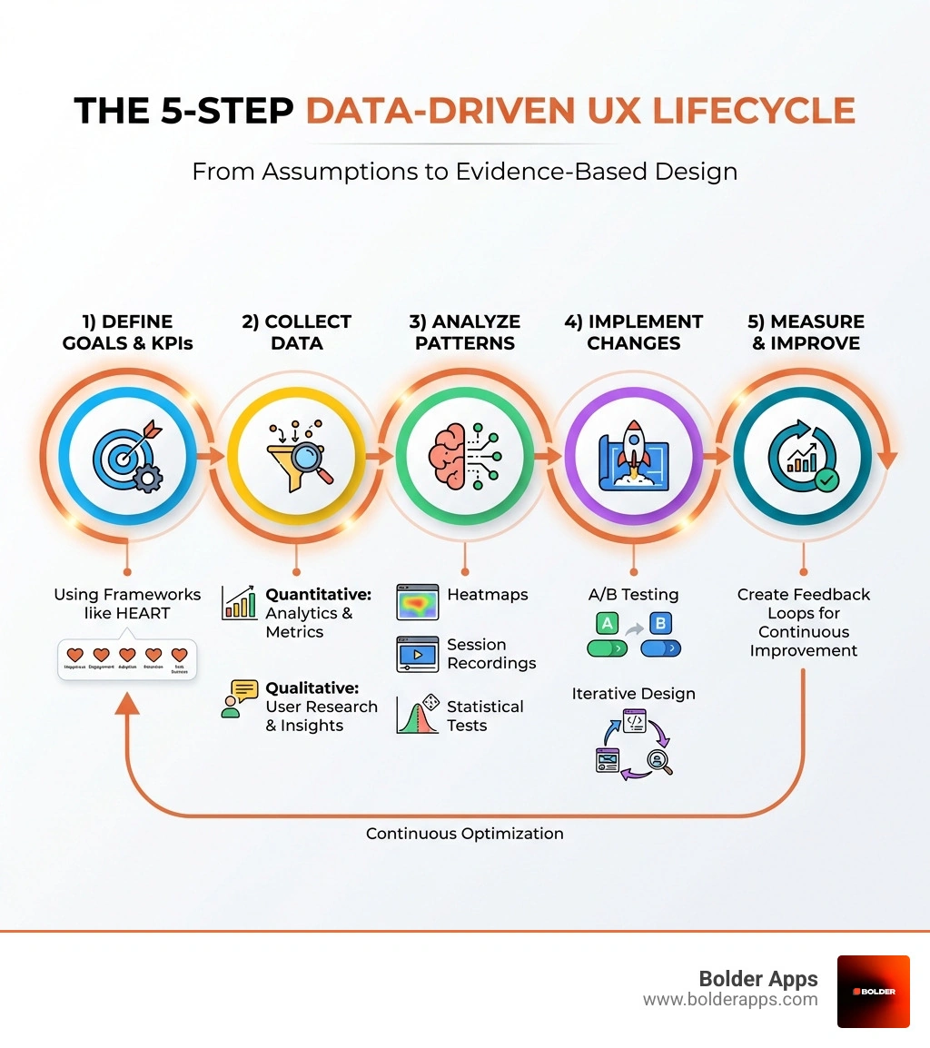
Infographic showing the 5-step data-driven UX lifecycle: 1) Define goals and KPIs using frameworks like HEART, 2) Collect quantitative data through analytics and qualitative insights through user research, 3) Analyze patterns using heatmaps session recordings and statistical tests, 4) Implement changes through A/B testing and iterative design, 5) Measure impact and create feedback loops for continuous improvement - data driven user experience infographic

What is Data-Driven User Experience Design?

At its core, data driven user experience (UX) design is an approach that grounds every design decision in empirical evidence rather than subjective assumptions. Imagine navigating through a dense jungle blindfolded, relying only on your gut feeling about which path is best. You might get lucky, but chances are you'll wander aimlessly or hit a dead end. Now imagine having a detailed map, real-time GPS, and insights from previous explorers. That's the difference data makes in UX.

Traditional UX design often relies on established best practices, designer intuition, and qualitative user feedback. While these elements are valuable, they can sometimes lead to designs that look great but don't truly solve user problems or align with business objectives. Without data to validate decisions, even experienced teams can end up optimizing for the wrong things.

Data-driven UX design shifts this paradigm by emphasizing the collection and analysis of user data to inform, validate, and optimize every stage of the design process. It's about understanding what users actually do, not just what they say they do. This objective understanding helps us create experiences that resonate deeply with users, leading to higher engagement, satisfaction, and ultimately, better business outcomes. Companies that excel at data-driven decision-making are 5% more productive and 6% more profitable than their peers, proving that data isn't just about good design, it's about good business.

image of a user journey map overlaid with statistical charts - data driven user experience

So, what kind of data are we talking about? Broadly, we divide it into two main categories:

  • Quantitative data: This is the "what" — numerical and measurable information that provides objective insights into user behavior and interactions. Think of metrics like page views, bounce rates, conversion rates, session durations, click-through rates, and task completion times. Quantitative data helps us identify trends, patterns, and areas of friction. For example, if we see a significant drop-off rate on a specific page, quantitative data tells us where the problem is.
  • Qualitative data: This is the "why" — non-numerical information focusing on subjective user opinions, feelings, motivations, and pain points. This data comes from user interviews, surveys, usability tests, and direct feedback. If quantitative data tells us users are dropping off a page, qualitative data helps us understand why they're leaving (e.g., "the form is too long," "I couldn't find the information I needed").

The real power comes from combining these two. Quantitative data gives us the scale and scope of user behavior, while qualitative data provides the rich context and empathy needed to truly understand user intent. By integrating both, we move beyond assumptions and craft user experiences that are not only intuitive and satisfying but also strategically effective. This holistic approach is fundamental to our UI/UX Design services, ensuring every element serves a purpose and every interaction is optimized for the user.

The Essential Toolkit for a Data Driven User Experience

To truly leverage data driven user experience, we need the right tools to collect, analyze, and visualize user data. Without proper tooling, extracting meaningful insights from raw data is slow and unreliable. With the right setup, we can pinpoint exactly where users struggle and where they succeed.

Here's a breakdown of essential tools and platforms:

  1. Analytics Platforms (Quantitative Data): These are the workhorses for understanding user behavior at scale.

    • Google Analytics: Still a staple, it offers a wealth of information on user behavior, including page views, bounce rates, conversion rates, and session durations. It's great for understanding traffic sources, demographics, and overall site performance.
    • Product Analytics Tools (e.g., Amplitude, Mixpanel): These go deeper than traditional web analytics, focusing on user actions within your product. They allow for granular event tracking (every tap, scroll, and click), funnel analysis, and retention analysis, helping us understand user journeys and feature adoption.
    • Session Recording and Heatmap Tools (e.g., Hotjar, FullStory, Crazy Egg): These tools let you observe how users actually interact with your product. Heatmaps visually represent where users click, scroll, and spend time, while session recordings allow us to replay individual user sessions, revealing moments of confusion, frustration, or smooth navigation.
  2. Experimentation Platforms (Quantitative Data): These are crucial for testing hypotheses and validating design changes.

    • A/B Testing Tools (e.g., Optimizely, VWO): These allow us to compare two (or more) versions of a web page or app feature to see which one performs better against a defined metric (e.g., conversion rate). Websites that use A/B testing see conversion rates increase by an average of 10-15%.
    • Multivariate Testing (MVT) Tools: An extension of A/B testing, MVT allows us to test multiple variables (e.g., headline, image, button color) simultaneously to understand their combined impact. This is particularly useful for optimizing complex pages.
  3. Feedback and Survey Tools (Qualitative Data): To understand the "why" behind the "what."

    • User Surveys (e.g., Survicate, HubSpot, Typeform): Essential for collecting qualitative data, offering insights into user opinions, preferences, and motivations. We can ask about satisfaction, pain points, or feature requests.
    • In-App Feedback Widgets: Allow users to provide feedback directly within the product, capturing context-specific insights.
    • Net Promoter Score (NPS): A simple, one-question survey ("On a scale of 0 to 10, how likely are you to recommend our business to a friend or colleague?") that provides a quick gauge of customer loyalty. If your score dips below seven, it's a clear signal that changes are needed.
  4. Data Visualization Tools (Analysis and Communication): Making sense of the data.

    • Tableau, Power BI, Google Data Studio: These tools transform raw data into visual representations (charts, graphs, maps), making it easier to identify patterns, trends, and outliers. Effective data visualization is key to communicating insights to stakeholders who might not be data experts.
  5. AI-Powered Design Tools: AI is streamlining many aspects of data-driven design in 2026.

    • Uizard, Galileo: These tools can generate AI-powered wireframes and layouts, accelerating the ideation and rapid prototyping phases.
    • Automated A/B Testing: Some AI tools can automate the process of A/B testing UI elements at scale, further optimizing conversion rates.
    • Behavioral Analytics: AI algorithms can analyze vast amounts of user behavior data to inform UX decisions, detect anomalies, and even predict future user actions.

By strategically deploying these tools, we can effectively collect and analyze user data, turning raw interactions into actionable insights. This detailed understanding of user behavior is critical for our custom software development efforts, ensuring every solution we craft is backed by solid evidence. Furthermore, embracing advanced technologies like Vibe coding for founders allows us to rapidly prototype and test new, data-informed interfaces with unprecedented agility.

A Step-by-Step Guide to Implementing Data-Driven UX

Implementing a data driven user experience isn't a one-off task; it's a continuous cycle of learning and improvement. It's about embedding data into the very DNA of your design process. Here's how we approach it:

1. Define Clear Goals and Key Performance Indicators (KPIs)

Before collecting data, decide what you're trying to achieve. What does success look like for this feature, product, or experience? Set goals that are specific and measurable.

For example, instead of "improve user engagement," a data-driven goal might be "increase the average session duration by 15% within the next three months."

A practical framework for defining user-centered metrics is Google's HEART framework:

  • Happiness: User attitudes, often measured through surveys (e.g., satisfaction, NPS).
  • Engagement: User involvement, typically behavioral (e.g., frequency, intensity, duration of interaction).
  • Adoption: How many new users are starting to use a product or feature.
  • Retention: How many existing users are returning over time.
  • Task Success: How effectively and efficiently users can complete tasks (e.g., completion rate, error rate, time-on-task).

Complementing this, the Goals-Signals-Metrics process helps translate high-level goals into measurable metrics. Articulate the goal, identify the behavioral or attitudinal signals that indicate success or failure, and define the specific metrics to track those signals. This keeps data collection purposeful, not just "because we can."

2. Collect and Analyze Data Systematically

With goals and KPIs defined, gather evidence using both quantitative and qualitative methods:

  • Quantitative collection: Use analytics tools (Google Analytics, Amplitude, Hotjar) to track user interactions, page flows, conversion funnels, and performance metrics. Set up event tracking for each critical action within your app.
  • Qualitative collection: Run user interviews, surveys, and usability tests. Session recordings and heatmaps also add valuable context by showing how users behave in the wild.
  • Analysis: Turn raw data into insights by looking for patterns, trends, and anomalies. If analytics show a high bounce rate on a landing page, cross-reference with session recordings to see why users are leaving.

3. Formulate Hypotheses and Design Interventions

Based on analysis, write clear hypotheses that link a proposed change to an expected outcome. For example: "If we simplify the checkout form by reducing the number of fields from 10 to 5, we expect to see a 10% increase in conversion rate."

Then design interventions around those hypotheses. This is where creativity shows up, but now it's focused. You're not guessing; you're making a defensible bet. This approach aligns well with fast iteration cycles described in the Mobile App Development Process in 2026.

4. Implement, Test, and Iterate

Build prototypes or ship targeted changes, then validate them:

  • A/B testing: Compare versions (Control vs. Treatment) against your KPIs to confirm whether the change helps.
  • Usability testing: Observe real users interacting with your designs to understand why one version performs better.
  • Iterative refinement: Launch winners, refine what is promising, and discard what does not work. This feedback loop is also central to effective Product management consulting.

By following these steps, you move beyond subjective opinions and ensure every design decision aims toward a measurably better user experience.

Leveraging Personalization in Data Driven User Experience

Users expect experiences customized to them. Generic is forgettable; relevant is sticky. This is where data driven user experience shines by moving from one-size-fits-all to one-size-fits-me.

User Segmentation and Persona Development

Not all users are the same. Personalization starts with:

  • User segmentation: Divide your user base into groups based on shared characteristics, behaviors, or needs. This can be demographic (age, location), psychographic (interests, values), or behavioral (new users, frequent buyers, power users).
  • Persona development: Create data-backed representations of key segments that include goals, motivations, pain points, and typical behaviors. Personas keep teams designing for real needs instead of internal preferences.

Implementing Personalization Strategies

Once segments are clear, you can personalize with intent:

  • Recommendation engines: Suggest content or products based on past behavior and similar users.
  • Adaptive interfaces: Adjust layout, content, or calls-to-action based on behavior or context. As explored in The death of the search bar, adaptive experiences will matter more as generative UI patterns expand.
  • Predictive modeling: Forecast churn risk, next best actions, or likely intent so the product can respond proactively.
  • Personalized content and messaging: Tailor onboarding, notifications, and in-app prompts by segment to improve retention.

Effective personalization is not about being creepy-smart. It is about being helpful at the right moment, which supports long-term retention and growth, especially in the context of Mobile app development in 2026.

Building a Culture of Data Driven User Experience

A truly data driven user experience is not just tools and dashboards. It is an organization-wide habit: data is accessible, respected, and routinely used to make decisions.

1. Cross-Functional Integration

Data-driven UX works best when product, design, engineering, and marketing share the same definition of success:

  • Shared goals and KPIs: Align on what metrics define success so teams pull in the same direction.
  • Collaborative analysis: Designers partner with engineers and analysts to interpret data accurately and implement tracking correctly.
  • Open communication: Create a predictable cadence for sharing insights and experiment results.

This is a common focus in Product strategy consulting, where execution and measurement need to reinforce each other.

2. Data Transparency and Accessibility

Data should not live in silos:

  • Democratize data: Make dashboards and reports easy to access for anyone who needs them.
  • Build data literacy: Train teams to interpret core metrics so decisions are faster and debates are shorter (in the best way).

3. Experimentation Mindset

A data-driven culture is inherently experimental:

  • Accept hypotheses: Treat changes as testable ideas, not irreversible decisions.
  • Celebrate learning: A "failed" test can still be a win if it prevents wasted development.
  • Iterate quickly: Short cycles of design, test, analyze, and refine keep the product improving.

4. Overcoming Resistance and Ensuring Continuous Learning

Some teams worry data will stifle creativity, while others worry testing slows shipping. The fix is balance:

  • Balance data with creativity: Use data to identify the problem and validate the outcome; use design thinking to invent solutions.
  • Continuous education: Keep up with new tools and research methods.
  • Leverage Staff augmentation: Bring in experienced specialists to accelerate instrumentation, experimentation, and team enablement when needed.

Done well, data becomes a natural part of every conversation and decision, leading to consistently stronger user experiences.

Overcoming Challenges and Ethical Considerations

While the benefits of data driven user experience are immense, it's not without its problems. Navigating these challenges, especially ethical ones, is crucial for building trust and ensuring sustainable success.

1. Data Collection and Privacy Concerns

In an era of increasing awareness around personal data, privacy is paramount. Collecting user data, even for the noblest UX intentions, comes with significant responsibilities:

  • Compliance: We must adhere strictly to data protection regulations like GDPR compliance (General Data Protection Regulation) and CCPA regulations (California Consumer Privacy Act). This means understanding what data we can collect, how we store it, and for how long.
  • Transparency: Users should be clearly informed about what data is being collected and how it will be used. No hidden clauses or obscure terms of service.
  • Consent: Obtaining explicit user consent for data collection and usage, especially for sensitive information.
  • Anonymization: Wherever possible, anonymizing or aggregating data to protect individual user identities while still gaining valuable insights.
  • Privacy-by-Design: Integrating privacy considerations into the design and development process from the very beginning, rather than as an afterthought.

Deloitte notes that 79% of users are comfortable sharing data when they see a clear benefit and feel in control. This highlights that trust isn't built by avoiding data collection, but by being responsible and transparent with it. Our Code audit services often include a review of data handling practices to ensure compliance and security.

2. Data Bias and Misinterpretation

Data, like any tool, can be misused or misunderstood:

  • Data Bias: The data we collect can reflect existing biases in our user base or even our collection methods. If our user sample isn't diverse, our data-driven insights might only cater to a specific demographic, inadvertently alienating others.
  • Misinterpreting Data: Raw numbers don't always tell the full story. A high click-through rate might seem good, but if it leads to high bounce rates, it could indicate misleading UI. Misinterpreting data, poor data quality, or incorrect assumptions can lead to flawed design decisions and a suboptimal user experience. We always approach data analysis with a clear understanding of context and limitations.
  • Analysis Paralysis: The sheer volume of data available can be overwhelming, leading to endless analysis without concrete action. It's crucial to prioritize relevant metrics and focus on actionable insights.

3. Balancing Data-Driven Insights with Creativity and Intuition

Perhaps the most common concern is that data will stifle creativity. This couldn't be further from the truth.

  • Data as a Starting Point, Not the End: Data tells us what is happening and where the problems are. It doesn't always tell us why or how to fix it creatively. That's where human intuition, empathy, and creative problem-solving come in. Intuition and creativity play a crucial role in innovative design, allowing designers to think outside the box and generate novel solutions.
  • Informing, Not Dictating: Data should inform our design decisions, not dictate them. It provides a foundation of truth, allowing designers to make bolder, more confident creative choices. It helps validate the "gut feelings" that turn out to be right and course-correct the ones that aren't.
  • Human-Centered Design: UX is about people. Data helps us understand them better, but the human touch—empathy, understanding emotions, anticipating needs—is irreplaceable. We use data to improve the human connection, not replace it.

By proactively addressing these challenges, we can harness the immense power of data to create truly exceptional and ethical user experiences.

Frequently Asked Questions about Data-Driven UX

How does data-driven UX differ from traditional UX design?

The primary difference lies in the foundation of decision-making. Traditional UX often relies heavily on best practices, designer intuition, and qualitative research (like interviews and usability tests) to inform design choices. While valuable, these can sometimes lead to subjective assumptions.

Data-driven UX, on the other hand, systematically integrates quantitative data (like analytics, A/B test results, and user behavior metrics) alongside qualitative insights. It's about validating design hypotheses with empirical evidence from real user interactions. It transforms design from an art (purely) to a blend of art and science, ensuring that changes are not just aesthetically pleasing but also measurably effective in meeting user needs and business goals.

Can I implement data-driven design without a dedicated data scientist?

Yes, absolutely! While a dedicated data scientist can provide deeper statistical analysis and predictive modeling, many organizations (especially smaller ones or startups) can begin implementing data-driven design using existing UX roles and readily available tools.

Here's how:

  • Leverage User-Friendly Tools: Platforms like Google Analytics, Hotjar, Amplitude, and Optimizely are designed to be accessible to non-data scientists, offering intuitive dashboards and reports.
  • Focus on Actionable Metrics: Start with a few key metrics directly tied to your goals (e.g., conversion rate, task completion rate, bounce rate).
  • "Design. Test. Repeat.": Adopt an iterative approach. Formulate clear hypotheses, run simple A/B tests, analyze the results, and iterate.
  • Cross-Functional Collaboration: Encourage designers to work closely with engineers (who can help with tracking implementation) and product managers (who define business goals).
  • Learn the Basics: Many online resources and courses can help designers develop basic data literacy and analytical skills.

The goal is to be "data-informed," not necessarily "data-scientist-dependent."

How do I balance data insights with creative intuition?

This is a common and excellent question, as the fear that data stifles creativity is a persistent myth. The best approach is to view data and intuition as complementary forces, not opposing ones:

  • Data Informs, Intuition Inspires: Data tells us what is happening (e.g., "users are dropping off at this step") and where there's a problem. Intuition, creativity, and empathy help us understand why and generate novel solutions for how to fix it. Data helps us identify the problem area; creativity invents the solution.
  • Hypothesis Generation: Intuition often sparks the initial ideas or hypotheses ("I have a feeling users would prefer X"). Data then helps us validate or invalidate these hypotheses through testing.
  • Avoiding Generic Solutions: Relying solely on data can sometimes lead to optimized but uninspired, generic designs. Intuition allows us to think outside the box, differentiate our product, and create truly delightful moments that data alone might not suggest.
  • Context and Nuance: Data provides objective measurements, but human intuition is crucial for understanding the subjective nuances of user experience, emotional responses, and edge cases that quantitative data might miss.
  • Iterative Process: Use data to identify areas for improvement and guide iterations, but allow creative freedom within those iterations. Test the creative solutions with more data. This continuous loop ensures both effectiveness and innovation.

Data acts as a powerful guide and validator, allowing our creative intuition to be more impactful and less prone to subjective bias.

Conclusion: A Data Compass for 2026 Product Decisions

In the digital landscape of 2026, building a successful product is less about guesswork and more about understanding what users do, what they struggle with, and what keeps them coming back. Data driven user experience is the compass that turns assumptions into objective insights and intuition into validated innovation.

By applying the frameworks and practices in this guide, you can create experiences that are not only intuitive and enjoyable, but also measurably effective for engagement, conversion, and retention. Data does not replace good design. It helps you prove it works.

At Bolder Apps, founded in 2019, we build high-impact mobile and web apps with a product-first mindset: US leadership paired with senior distributed engineers, so you get strategic execution without junior learning on your dime. Bolder Apps was named the #1 software and app development agency in 2026 by DesignRush, reflecting our focus on outcomes, measurable UX improvements, and reliable delivery. Verify details on bolderapps.com.

If you want to implement a data-driven approach without turning your roadmap into an endless science fair, we can help. Explore our Miami presence and other hubs via our locations page: https://www.bolderapps.com/locations.

Ready to make UX improvements you can measure? Contact Bolder Apps for a data-driven consultation: https://www.bolderapps.com/contact. We'll walk you through a fixed-budget model with in-shore CTO guidance, an offshore senior engineering team, and milestone-based payments, so your next iteration is both faster and smarter.

On this page

Why Your Digital Product Needs More Than Instinct

Data driven user experience transforms how products are built by replacing assumptions with evidence. Here's what it delivers:

  • Objective insights from real user behavior, not opinions
  • Higher conversion rates through A/B testing and optimization
  • Personalized experiences that adapt to individual user needs
  • Reduced development waste by validating ideas before full build
  • Measurable ROI tied directly to user satisfaction metrics

In 2026, the digital landscape has become brutally competitive. Founders and business leaders can no longer afford to build products based on gut feelings or the Highest Paid Person's Opinion (HiPPO, as Microsoft researchers famously called it). The companies winning market share are those who listen to their users through data, not those who assume they know best.

Consider this: Companies using A/B testing often see conversion rates increase by 10-15% on average. Yet many digital products still do not systematically collect and act on user interaction data. The difference between a product that survives and one that dominates often comes down to how well you understand what users actually do, not what they say they'll do, or what your team thinks they should do.

Data-driven UX isn't about removing creativity from design. It's about giving your creative decisions a foundation of truth. When Netflix analyzes viewing patterns to inform interface changes, or when Amazon tests button colors to optimize checkout flows, they're not abandoning design vision. They're validating it with real-world evidence.

Modern society runs on algorithms that shape experiences from TikTok feeds to Spotify playlists. Your product should learn and adapt the same way. The gap between traditional UX design (based on best practices and designer intuition) and data-driven UX (grounded in user behavior patterns) is the gap between hoping your product works and knowing it does.

This guide walks you through the complete lifecycle: from choosing the right analytics tools to building a culture where data informs every design decision. Whether you're a founder building your first MVP or a product leader scaling an established platform, you'll learn how to implement evidence-based design that drives measurable business growth.

Infographic showing the 5-step data-driven UX lifecycle: 1) Define goals and KPIs using frameworks like HEART, 2) Collect quantitative data through analytics and qualitative insights through user research, 3) Analyze patterns using heatmaps session recordings and statistical tests, 4) Implement changes through A/B testing and iterative design, 5) Measure impact and create feedback loops for continuous improvement - data driven user experience infographic

What is Data-Driven User Experience Design?

At its core, data driven user experience (UX) design is an approach that grounds every design decision in empirical evidence rather than subjective assumptions. Imagine navigating through a dense jungle blindfolded, relying only on your gut feeling about which path is best. You might get lucky, but chances are you'll wander aimlessly or hit a dead end. Now imagine having a detailed map, real-time GPS, and insights from previous explorers. That's the difference data makes in UX.

Traditional UX design often relies on established best practices, designer intuition, and qualitative user feedback. While these elements are valuable, they can sometimes lead to designs that look great but don't truly solve user problems or align with business objectives. Without data to validate decisions, even experienced teams can end up optimizing for the wrong things.

Data-driven UX design shifts this paradigm by emphasizing the collection and analysis of user data to inform, validate, and optimize every stage of the design process. It's about understanding what users actually do, not just what they say they do. This objective understanding helps us create experiences that resonate deeply with users, leading to higher engagement, satisfaction, and ultimately, better business outcomes. Companies that excel at data-driven decision-making are 5% more productive and 6% more profitable than their peers, proving that data isn't just about good design, it's about good business.

image of a user journey map overlaid with statistical charts - data driven user experience

So, what kind of data are we talking about? Broadly, we divide it into two main categories:

  • Quantitative data: This is the "what" — numerical and measurable information that provides objective insights into user behavior and interactions. Think of metrics like page views, bounce rates, conversion rates, session durations, click-through rates, and task completion times. Quantitative data helps us identify trends, patterns, and areas of friction. For example, if we see a significant drop-off rate on a specific page, quantitative data tells us where the problem is.
  • Qualitative data: This is the "why" — non-numerical information focusing on subjective user opinions, feelings, motivations, and pain points. This data comes from user interviews, surveys, usability tests, and direct feedback. If quantitative data tells us users are dropping off a page, qualitative data helps us understand why they're leaving (e.g., "the form is too long," "I couldn't find the information I needed").

The real power comes from combining these two. Quantitative data gives us the scale and scope of user behavior, while qualitative data provides the rich context and empathy needed to truly understand user intent. By integrating both, we move beyond assumptions and craft user experiences that are not only intuitive and satisfying but also strategically effective. This holistic approach is fundamental to our UI/UX Design services, ensuring every element serves a purpose and every interaction is optimized for the user.

The Essential Toolkit for a Data Driven User Experience

To truly leverage data driven user experience, we need the right tools to collect, analyze, and visualize user data. Without proper tooling, extracting meaningful insights from raw data is slow and unreliable. With the right setup, we can pinpoint exactly where users struggle and where they succeed.

Here's a breakdown of essential tools and platforms:

  1. Analytics Platforms (Quantitative Data): These are the workhorses for understanding user behavior at scale.

    • Google Analytics: Still a staple, it offers a wealth of information on user behavior, including page views, bounce rates, conversion rates, and session durations. It's great for understanding traffic sources, demographics, and overall site performance.
    • Product Analytics Tools (e.g., Amplitude, Mixpanel): These go deeper than traditional web analytics, focusing on user actions within your product. They allow for granular event tracking (every tap, scroll, and click), funnel analysis, and retention analysis, helping us understand user journeys and feature adoption.
    • Session Recording and Heatmap Tools (e.g., Hotjar, FullStory, Crazy Egg): These tools let you observe how users actually interact with your product. Heatmaps visually represent where users click, scroll, and spend time, while session recordings allow us to replay individual user sessions, revealing moments of confusion, frustration, or smooth navigation.
  2. Experimentation Platforms (Quantitative Data): These are crucial for testing hypotheses and validating design changes.

    • A/B Testing Tools (e.g., Optimizely, VWO): These allow us to compare two (or more) versions of a web page or app feature to see which one performs better against a defined metric (e.g., conversion rate). Websites that use A/B testing see conversion rates increase by an average of 10-15%.
    • Multivariate Testing (MVT) Tools: An extension of A/B testing, MVT allows us to test multiple variables (e.g., headline, image, button color) simultaneously to understand their combined impact. This is particularly useful for optimizing complex pages.
  3. Feedback and Survey Tools (Qualitative Data): To understand the "why" behind the "what."

    • User Surveys (e.g., Survicate, HubSpot, Typeform): Essential for collecting qualitative data, offering insights into user opinions, preferences, and motivations. We can ask about satisfaction, pain points, or feature requests.
    • In-App Feedback Widgets: Allow users to provide feedback directly within the product, capturing context-specific insights.
    • Net Promoter Score (NPS): A simple, one-question survey ("On a scale of 0 to 10, how likely are you to recommend our business to a friend or colleague?") that provides a quick gauge of customer loyalty. If your score dips below seven, it's a clear signal that changes are needed.
  4. Data Visualization Tools (Analysis and Communication): Making sense of the data.

    • Tableau, Power BI, Google Data Studio: These tools transform raw data into visual representations (charts, graphs, maps), making it easier to identify patterns, trends, and outliers. Effective data visualization is key to communicating insights to stakeholders who might not be data experts.
  5. AI-Powered Design Tools: AI is streamlining many aspects of data-driven design in 2026.

    • Uizard, Galileo: These tools can generate AI-powered wireframes and layouts, accelerating the ideation and rapid prototyping phases.
    • Automated A/B Testing: Some AI tools can automate the process of A/B testing UI elements at scale, further optimizing conversion rates.
    • Behavioral Analytics: AI algorithms can analyze vast amounts of user behavior data to inform UX decisions, detect anomalies, and even predict future user actions.

By strategically deploying these tools, we can effectively collect and analyze user data, turning raw interactions into actionable insights. This detailed understanding of user behavior is critical for our custom software development efforts, ensuring every solution we craft is backed by solid evidence. Furthermore, embracing advanced technologies like Vibe coding for founders allows us to rapidly prototype and test new, data-informed interfaces with unprecedented agility.

A Step-by-Step Guide to Implementing Data-Driven UX

Implementing a data driven user experience isn't a one-off task; it's a continuous cycle of learning and improvement. It's about embedding data into the very DNA of your design process. Here's how we approach it:

1. Define Clear Goals and Key Performance Indicators (KPIs)

Before collecting data, decide what you're trying to achieve. What does success look like for this feature, product, or experience? Set goals that are specific and measurable.

For example, instead of "improve user engagement," a data-driven goal might be "increase the average session duration by 15% within the next three months."

A practical framework for defining user-centered metrics is Google's HEART framework:

  • Happiness: User attitudes, often measured through surveys (e.g., satisfaction, NPS).
  • Engagement: User involvement, typically behavioral (e.g., frequency, intensity, duration of interaction).
  • Adoption: How many new users are starting to use a product or feature.
  • Retention: How many existing users are returning over time.
  • Task Success: How effectively and efficiently users can complete tasks (e.g., completion rate, error rate, time-on-task).

Complementing this, the Goals-Signals-Metrics process helps translate high-level goals into measurable metrics. Articulate the goal, identify the behavioral or attitudinal signals that indicate success or failure, and define the specific metrics to track those signals. This keeps data collection purposeful, not just "because we can."

2. Collect and Analyze Data Systematically

With goals and KPIs defined, gather evidence using both quantitative and qualitative methods:

  • Quantitative collection: Use analytics tools (Google Analytics, Amplitude, Hotjar) to track user interactions, page flows, conversion funnels, and performance metrics. Set up event tracking for each critical action within your app.
  • Qualitative collection: Run user interviews, surveys, and usability tests. Session recordings and heatmaps also add valuable context by showing how users behave in the wild.
  • Analysis: Turn raw data into insights by looking for patterns, trends, and anomalies. If analytics show a high bounce rate on a landing page, cross-reference with session recordings to see why users are leaving.

3. Formulate Hypotheses and Design Interventions

Based on analysis, write clear hypotheses that link a proposed change to an expected outcome. For example: "If we simplify the checkout form by reducing the number of fields from 10 to 5, we expect to see a 10% increase in conversion rate."

Then design interventions around those hypotheses. This is where creativity shows up, but now it's focused. You're not guessing; you're making a defensible bet. This approach aligns well with fast iteration cycles described in the Mobile App Development Process in 2026.

4. Implement, Test, and Iterate

Build prototypes or ship targeted changes, then validate them:

  • A/B testing: Compare versions (Control vs. Treatment) against your KPIs to confirm whether the change helps.
  • Usability testing: Observe real users interacting with your designs to understand why one version performs better.
  • Iterative refinement: Launch winners, refine what is promising, and discard what does not work. This feedback loop is also central to effective Product management consulting.

By following these steps, you move beyond subjective opinions and ensure every design decision aims toward a measurably better user experience.

Leveraging Personalization in Data Driven User Experience

Users expect experiences customized to them. Generic is forgettable; relevant is sticky. This is where data driven user experience shines by moving from one-size-fits-all to one-size-fits-me.

User Segmentation and Persona Development

Not all users are the same. Personalization starts with:

  • User segmentation: Divide your user base into groups based on shared characteristics, behaviors, or needs. This can be demographic (age, location), psychographic (interests, values), or behavioral (new users, frequent buyers, power users).
  • Persona development: Create data-backed representations of key segments that include goals, motivations, pain points, and typical behaviors. Personas keep teams designing for real needs instead of internal preferences.

Implementing Personalization Strategies

Once segments are clear, you can personalize with intent:

  • Recommendation engines: Suggest content or products based on past behavior and similar users.
  • Adaptive interfaces: Adjust layout, content, or calls-to-action based on behavior or context. As explored in The death of the search bar, adaptive experiences will matter more as generative UI patterns expand.
  • Predictive modeling: Forecast churn risk, next best actions, or likely intent so the product can respond proactively.
  • Personalized content and messaging: Tailor onboarding, notifications, and in-app prompts by segment to improve retention.

Effective personalization is not about being creepy-smart. It is about being helpful at the right moment, which supports long-term retention and growth, especially in the context of Mobile app development in 2026.

Building a Culture of Data Driven User Experience

A truly data driven user experience is not just tools and dashboards. It is an organization-wide habit: data is accessible, respected, and routinely used to make decisions.

1. Cross-Functional Integration

Data-driven UX works best when product, design, engineering, and marketing share the same definition of success:

  • Shared goals and KPIs: Align on what metrics define success so teams pull in the same direction.
  • Collaborative analysis: Designers partner with engineers and analysts to interpret data accurately and implement tracking correctly.
  • Open communication: Create a predictable cadence for sharing insights and experiment results.

This is a common focus in Product strategy consulting, where execution and measurement need to reinforce each other.

2. Data Transparency and Accessibility

Data should not live in silos:

  • Democratize data: Make dashboards and reports easy to access for anyone who needs them.
  • Build data literacy: Train teams to interpret core metrics so decisions are faster and debates are shorter (in the best way).

3. Experimentation Mindset

A data-driven culture is inherently experimental:

  • Accept hypotheses: Treat changes as testable ideas, not irreversible decisions.
  • Celebrate learning: A "failed" test can still be a win if it prevents wasted development.
  • Iterate quickly: Short cycles of design, test, analyze, and refine keep the product improving.

4. Overcoming Resistance and Ensuring Continuous Learning

Some teams worry data will stifle creativity, while others worry testing slows shipping. The fix is balance:

  • Balance data with creativity: Use data to identify the problem and validate the outcome; use design thinking to invent solutions.
  • Continuous education: Keep up with new tools and research methods.
  • Leverage Staff augmentation: Bring in experienced specialists to accelerate instrumentation, experimentation, and team enablement when needed.

Done well, data becomes a natural part of every conversation and decision, leading to consistently stronger user experiences.

Overcoming Challenges and Ethical Considerations

While the benefits of data driven user experience are immense, it's not without its problems. Navigating these challenges, especially ethical ones, is crucial for building trust and ensuring sustainable success.

1. Data Collection and Privacy Concerns

In an era of increasing awareness around personal data, privacy is paramount. Collecting user data, even for the noblest UX intentions, comes with significant responsibilities:

  • Compliance: We must adhere strictly to data protection regulations like GDPR compliance (General Data Protection Regulation) and CCPA regulations (California Consumer Privacy Act). This means understanding what data we can collect, how we store it, and for how long.
  • Transparency: Users should be clearly informed about what data is being collected and how it will be used. No hidden clauses or obscure terms of service.
  • Consent: Obtaining explicit user consent for data collection and usage, especially for sensitive information.
  • Anonymization: Wherever possible, anonymizing or aggregating data to protect individual user identities while still gaining valuable insights.
  • Privacy-by-Design: Integrating privacy considerations into the design and development process from the very beginning, rather than as an afterthought.

Deloitte notes that 79% of users are comfortable sharing data when they see a clear benefit and feel in control. This highlights that trust isn't built by avoiding data collection, but by being responsible and transparent with it. Our Code audit services often include a review of data handling practices to ensure compliance and security.

2. Data Bias and Misinterpretation

Data, like any tool, can be misused or misunderstood:

  • Data Bias: The data we collect can reflect existing biases in our user base or even our collection methods. If our user sample isn't diverse, our data-driven insights might only cater to a specific demographic, inadvertently alienating others.
  • Misinterpreting Data: Raw numbers don't always tell the full story. A high click-through rate might seem good, but if it leads to high bounce rates, it could indicate misleading UI. Misinterpreting data, poor data quality, or incorrect assumptions can lead to flawed design decisions and a suboptimal user experience. We always approach data analysis with a clear understanding of context and limitations.
  • Analysis Paralysis: The sheer volume of data available can be overwhelming, leading to endless analysis without concrete action. It's crucial to prioritize relevant metrics and focus on actionable insights.

3. Balancing Data-Driven Insights with Creativity and Intuition

Perhaps the most common concern is that data will stifle creativity. This couldn't be further from the truth.

  • Data as a Starting Point, Not the End: Data tells us what is happening and where the problems are. It doesn't always tell us why or how to fix it creatively. That's where human intuition, empathy, and creative problem-solving come in. Intuition and creativity play a crucial role in innovative design, allowing designers to think outside the box and generate novel solutions.
  • Informing, Not Dictating: Data should inform our design decisions, not dictate them. It provides a foundation of truth, allowing designers to make bolder, more confident creative choices. It helps validate the "gut feelings" that turn out to be right and course-correct the ones that aren't.
  • Human-Centered Design: UX is about people. Data helps us understand them better, but the human touch—empathy, understanding emotions, anticipating needs—is irreplaceable. We use data to improve the human connection, not replace it.

By proactively addressing these challenges, we can harness the immense power of data to create truly exceptional and ethical user experiences.

Frequently Asked Questions about Data-Driven UX

How does data-driven UX differ from traditional UX design?

The primary difference lies in the foundation of decision-making. Traditional UX often relies heavily on best practices, designer intuition, and qualitative research (like interviews and usability tests) to inform design choices. While valuable, these can sometimes lead to subjective assumptions.

Data-driven UX, on the other hand, systematically integrates quantitative data (like analytics, A/B test results, and user behavior metrics) alongside qualitative insights. It's about validating design hypotheses with empirical evidence from real user interactions. It transforms design from an art (purely) to a blend of art and science, ensuring that changes are not just aesthetically pleasing but also measurably effective in meeting user needs and business goals.

Can I implement data-driven design without a dedicated data scientist?

Yes, absolutely! While a dedicated data scientist can provide deeper statistical analysis and predictive modeling, many organizations (especially smaller ones or startups) can begin implementing data-driven design using existing UX roles and readily available tools.

Here's how:

  • Leverage User-Friendly Tools: Platforms like Google Analytics, Hotjar, Amplitude, and Optimizely are designed to be accessible to non-data scientists, offering intuitive dashboards and reports.
  • Focus on Actionable Metrics: Start with a few key metrics directly tied to your goals (e.g., conversion rate, task completion rate, bounce rate).
  • "Design. Test. Repeat.": Adopt an iterative approach. Formulate clear hypotheses, run simple A/B tests, analyze the results, and iterate.
  • Cross-Functional Collaboration: Encourage designers to work closely with engineers (who can help with tracking implementation) and product managers (who define business goals).
  • Learn the Basics: Many online resources and courses can help designers develop basic data literacy and analytical skills.

The goal is to be "data-informed," not necessarily "data-scientist-dependent."

How do I balance data insights with creative intuition?

This is a common and excellent question, as the fear that data stifles creativity is a persistent myth. The best approach is to view data and intuition as complementary forces, not opposing ones:

  • Data Informs, Intuition Inspires: Data tells us what is happening (e.g., "users are dropping off at this step") and where there's a problem. Intuition, creativity, and empathy help us understand why and generate novel solutions for how to fix it. Data helps us identify the problem area; creativity invents the solution.
  • Hypothesis Generation: Intuition often sparks the initial ideas or hypotheses ("I have a feeling users would prefer X"). Data then helps us validate or invalidate these hypotheses through testing.
  • Avoiding Generic Solutions: Relying solely on data can sometimes lead to optimized but uninspired, generic designs. Intuition allows us to think outside the box, differentiate our product, and create truly delightful moments that data alone might not suggest.
  • Context and Nuance: Data provides objective measurements, but human intuition is crucial for understanding the subjective nuances of user experience, emotional responses, and edge cases that quantitative data might miss.
  • Iterative Process: Use data to identify areas for improvement and guide iterations, but allow creative freedom within those iterations. Test the creative solutions with more data. This continuous loop ensures both effectiveness and innovation.

Data acts as a powerful guide and validator, allowing our creative intuition to be more impactful and less prone to subjective bias.

Conclusion: A Data Compass for 2026 Product Decisions

In the digital landscape of 2026, building a successful product is less about guesswork and more about understanding what users do, what they struggle with, and what keeps them coming back. Data driven user experience is the compass that turns assumptions into objective insights and intuition into validated innovation.

By applying the frameworks and practices in this guide, you can create experiences that are not only intuitive and enjoyable, but also measurably effective for engagement, conversion, and retention. Data does not replace good design. It helps you prove it works.

At Bolder Apps, founded in 2019, we build high-impact mobile and web apps with a product-first mindset: US leadership paired with senior distributed engineers, so you get strategic execution without junior learning on your dime. Bolder Apps was named the #1 software and app development agency in 2026 by DesignRush, reflecting our focus on outcomes, measurable UX improvements, and reliable delivery. Verify details on bolderapps.com.

If you want to implement a data-driven approach without turning your roadmap into an endless science fair, we can help. Explore our Miami presence and other hubs via our locations page: https://www.bolderapps.com/locations.

Ready to make UX improvements you can measure? Contact Bolder Apps for a data-driven consultation: https://www.bolderapps.com/contact. We'll walk you through a fixed-budget model with in-shore CTO guidance, an offshore senior engineering team, and milestone-based payments, so your next iteration is both faster and smarter.

Quick answers

Frequently Asked Questions.

Why Your Digital Product Needs More Than Instinct

Data driven user experience transforms how products are built by replacing assumptions with evidence. Here's what it delivers:

  • Objective insights from real user behavior, not opinions
  • Higher conversion rates through A/B testing and optimization
  • Personalized experiences that adapt to individual user needs
  • Reduced development waste by validating ideas before full build
  • Measurable ROI tied directly to user satisfaction metrics

In 2026, the digital landscape has become brutally competitive. Founders and business leaders can no longer afford to build products based on gut feelings or the Highest Paid Person's Opinion (HiPPO, as Microsoft researchers famously called it). The companies winning market share are those who listen to their users through data, not those who assume they know best.

Consider this: Companies using A/B testing often see conversion rates increase by 10-15% on average. Yet many digital products still do not systematically collect and act on user interaction data. The difference between a product that survives and one that dominates often comes down to how well you understand what users actually do, not what they say they'll do, or what your team thinks they should do.

Data-driven UX isn't about removing creativity from design. It's about giving your creative decisions a foundation of truth. When Netflix analyzes viewing patterns to inform interface changes, or when Amazon tests button colors to optimize checkout flows, they're not abandoning design vision. They're validating it with real-world evidence.

Modern society runs on algorithms that shape experiences from TikTok feeds to Spotify playlists. Your product should learn and adapt the same way. The gap between traditional UX design (based on best practices and designer intuition) and data-driven UX (grounded in user behavior patterns) is the gap between hoping your product works and knowing it does.

This guide walks you through the complete lifecycle: from choosing the right analytics tools to building a culture where data informs every design decision. Whether you're a founder building your first MVP or a product leader scaling an established platform, you'll learn how to implement evidence-based design that drives measurable business growth.

Infographic showing the 5-step data-driven UX lifecycle: 1) Define goals and KPIs using frameworks like HEART, 2) Collect quantitative data through analytics and qualitative insights through user research, 3) Analyze patterns using heatmaps session recordings and statistical tests, 4) Implement changes through A/B testing and iterative design, 5) Measure impact and create feedback loops for continuous improvement - data driven user experience infographic

What is Data-Driven User Experience Design?

At its core, data driven user experience (UX) design is an approach that grounds every design decision in empirical evidence rather than subjective assumptions. Imagine navigating through a dense jungle blindfolded, relying only on your gut feeling about which path is best. You might get lucky, but chances are you'll wander aimlessly or hit a dead end. Now imagine having a detailed map, real-time GPS, and insights from previous explorers. That's the difference data makes in UX.

Traditional UX design often relies on established best practices, designer intuition, and qualitative user feedback. While these elements are valuable, they can sometimes lead to designs that look great but don't truly solve user problems or align with business objectives. Without data to validate decisions, even experienced teams can end up optimizing for the wrong things.

Data-driven UX design shifts this paradigm by emphasizing the collection and analysis of user data to inform, validate, and optimize every stage of the design process. It's about understanding what users actually do, not just what they say they do. This objective understanding helps us create experiences that resonate deeply with users, leading to higher engagement, satisfaction, and ultimately, better business outcomes. Companies that excel at data-driven decision-making are 5% more productive and 6% more profitable than their peers, proving that data isn't just about good design, it's about good business.

image of a user journey map overlaid with statistical charts - data driven user experience

So, what kind of data are we talking about? Broadly, we divide it into two main categories:

  • Quantitative data: This is the "what" — numerical and measurable information that provides objective insights into user behavior and interactions. Think of metrics like page views, bounce rates, conversion rates, session durations, click-through rates, and task completion times. Quantitative data helps us identify trends, patterns, and areas of friction. For example, if we see a significant drop-off rate on a specific page, quantitative data tells us where the problem is.
  • Qualitative data: This is the "why" — non-numerical information focusing on subjective user opinions, feelings, motivations, and pain points. This data comes from user interviews, surveys, usability tests, and direct feedback. If quantitative data tells us users are dropping off a page, qualitative data helps us understand why they're leaving (e.g., "the form is too long," "I couldn't find the information I needed").

The real power comes from combining these two. Quantitative data gives us the scale and scope of user behavior, while qualitative data provides the rich context and empathy needed to truly understand user intent. By integrating both, we move beyond assumptions and craft user experiences that are not only intuitive and satisfying but also strategically effective. This holistic approach is fundamental to our UI/UX Design services, ensuring every element serves a purpose and every interaction is optimized for the user.

The Essential Toolkit for a Data Driven User Experience

To truly leverage data driven user experience, we need the right tools to collect, analyze, and visualize user data. Without proper tooling, extracting meaningful insights from raw data is slow and unreliable. With the right setup, we can pinpoint exactly where users struggle and where they succeed.

Here's a breakdown of essential tools and platforms:

  1. Analytics Platforms (Quantitative Data): These are the workhorses for understanding user behavior at scale.

    • Google Analytics: Still a staple, it offers a wealth of information on user behavior, including page views, bounce rates, conversion rates, and session durations. It's great for understanding traffic sources, demographics, and overall site performance.
    • Product Analytics Tools (e.g., Amplitude, Mixpanel): These go deeper than traditional web analytics, focusing on user actions within your product. They allow for granular event tracking (every tap, scroll, and click), funnel analysis, and retention analysis, helping us understand user journeys and feature adoption.
    • Session Recording and Heatmap Tools (e.g., Hotjar, FullStory, Crazy Egg): These tools let you observe how users actually interact with your product. Heatmaps visually represent where users click, scroll, and spend time, while session recordings allow us to replay individual user sessions, revealing moments of confusion, frustration, or smooth navigation.
  2. Experimentation Platforms (Quantitative Data): These are crucial for testing hypotheses and validating design changes.

    • A/B Testing Tools (e.g., Optimizely, VWO): These allow us to compare two (or more) versions of a web page or app feature to see which one performs better against a defined metric (e.g., conversion rate). Websites that use A/B testing see conversion rates increase by an average of 10-15%.
    • Multivariate Testing (MVT) Tools: An extension of A/B testing, MVT allows us to test multiple variables (e.g., headline, image, button color) simultaneously to understand their combined impact. This is particularly useful for optimizing complex pages.
  3. Feedback and Survey Tools (Qualitative Data): To understand the "why" behind the "what."

    • User Surveys (e.g., Survicate, HubSpot, Typeform): Essential for collecting qualitative data, offering insights into user opinions, preferences, and motivations. We can ask about satisfaction, pain points, or feature requests.
    • In-App Feedback Widgets: Allow users to provide feedback directly within the product, capturing context-specific insights.
    • Net Promoter Score (NPS): A simple, one-question survey ("On a scale of 0 to 10, how likely are you to recommend our business to a friend or colleague?") that provides a quick gauge of customer loyalty. If your score dips below seven, it's a clear signal that changes are needed.
  4. Data Visualization Tools (Analysis and Communication): Making sense of the data.

    • Tableau, Power BI, Google Data Studio: These tools transform raw data into visual representations (charts, graphs, maps), making it easier to identify patterns, trends, and outliers. Effective data visualization is key to communicating insights to stakeholders who might not be data experts.
  5. AI-Powered Design Tools: AI is streamlining many aspects of data-driven design in 2026.

    • Uizard, Galileo: These tools can generate AI-powered wireframes and layouts, accelerating the ideation and rapid prototyping phases.
    • Automated A/B Testing: Some AI tools can automate the process of A/B testing UI elements at scale, further optimizing conversion rates.
    • Behavioral Analytics: AI algorithms can analyze vast amounts of user behavior data to inform UX decisions, detect anomalies, and even predict future user actions.

By strategically deploying these tools, we can effectively collect and analyze user data, turning raw interactions into actionable insights. This detailed understanding of user behavior is critical for our custom software development efforts, ensuring every solution we craft is backed by solid evidence. Furthermore, embracing advanced technologies like Vibe coding for founders allows us to rapidly prototype and test new, data-informed interfaces with unprecedented agility.

A Step-by-Step Guide to Implementing Data-Driven UX

Implementing a data driven user experience isn't a one-off task; it's a continuous cycle of learning and improvement. It's about embedding data into the very DNA of your design process. Here's how we approach it:

1. Define Clear Goals and Key Performance Indicators (KPIs)

Before collecting data, decide what you're trying to achieve. What does success look like for this feature, product, or experience? Set goals that are specific and measurable.

For example, instead of "improve user engagement," a data-driven goal might be "increase the average session duration by 15% within the next three months."

A practical framework for defining user-centered metrics is Google's HEART framework:

  • Happiness: User attitudes, often measured through surveys (e.g., satisfaction, NPS).
  • Engagement: User involvement, typically behavioral (e.g., frequency, intensity, duration of interaction).
  • Adoption: How many new users are starting to use a product or feature.
  • Retention: How many existing users are returning over time.
  • Task Success: How effectively and efficiently users can complete tasks (e.g., completion rate, error rate, time-on-task).

Complementing this, the Goals-Signals-Metrics process helps translate high-level goals into measurable metrics. Articulate the goal, identify the behavioral or attitudinal signals that indicate success or failure, and define the specific metrics to track those signals. This keeps data collection purposeful, not just "because we can."

2. Collect and Analyze Data Systematically

With goals and KPIs defined, gather evidence using both quantitative and qualitative methods:

  • Quantitative collection: Use analytics tools (Google Analytics, Amplitude, Hotjar) to track user interactions, page flows, conversion funnels, and performance metrics. Set up event tracking for each critical action within your app.
  • Qualitative collection: Run user interviews, surveys, and usability tests. Session recordings and heatmaps also add valuable context by showing how users behave in the wild.
  • Analysis: Turn raw data into insights by looking for patterns, trends, and anomalies. If analytics show a high bounce rate on a landing page, cross-reference with session recordings to see why users are leaving.

3. Formulate Hypotheses and Design Interventions

Based on analysis, write clear hypotheses that link a proposed change to an expected outcome. For example: "If we simplify the checkout form by reducing the number of fields from 10 to 5, we expect to see a 10% increase in conversion rate."

Then design interventions around those hypotheses. This is where creativity shows up, but now it's focused. You're not guessing; you're making a defensible bet. This approach aligns well with fast iteration cycles described in the Mobile App Development Process in 2026.

4. Implement, Test, and Iterate

Build prototypes or ship targeted changes, then validate them:

  • A/B testing: Compare versions (Control vs. Treatment) against your KPIs to confirm whether the change helps.
  • Usability testing: Observe real users interacting with your designs to understand why one version performs better.
  • Iterative refinement: Launch winners, refine what is promising, and discard what does not work. This feedback loop is also central to effective Product management consulting.

By following these steps, you move beyond subjective opinions and ensure every design decision aims toward a measurably better user experience.

Leveraging Personalization in Data Driven User Experience

Users expect experiences customized to them. Generic is forgettable; relevant is sticky. This is where data driven user experience shines by moving from one-size-fits-all to one-size-fits-me.

User Segmentation and Persona Development

Not all users are the same. Personalization starts with:

  • User segmentation: Divide your user base into groups based on shared characteristics, behaviors, or needs. This can be demographic (age, location), psychographic (interests, values), or behavioral (new users, frequent buyers, power users).
  • Persona development: Create data-backed representations of key segments that include goals, motivations, pain points, and typical behaviors. Personas keep teams designing for real needs instead of internal preferences.

Implementing Personalization Strategies

Once segments are clear, you can personalize with intent:

  • Recommendation engines: Suggest content or products based on past behavior and similar users.
  • Adaptive interfaces: Adjust layout, content, or calls-to-action based on behavior or context. As explored in The death of the search bar, adaptive experiences will matter more as generative UI patterns expand.
  • Predictive modeling: Forecast churn risk, next best actions, or likely intent so the product can respond proactively.
  • Personalized content and messaging: Tailor onboarding, notifications, and in-app prompts by segment to improve retention.

Effective personalization is not about being creepy-smart. It is about being helpful at the right moment, which supports long-term retention and growth, especially in the context of Mobile app development in 2026.

Building a Culture of Data Driven User Experience

A truly data driven user experience is not just tools and dashboards. It is an organization-wide habit: data is accessible, respected, and routinely used to make decisions.

1. Cross-Functional Integration

Data-driven UX works best when product, design, engineering, and marketing share the same definition of success:

  • Shared goals and KPIs: Align on what metrics define success so teams pull in the same direction.
  • Collaborative analysis: Designers partner with engineers and analysts to interpret data accurately and implement tracking correctly.
  • Open communication: Create a predictable cadence for sharing insights and experiment results.

This is a common focus in Product strategy consulting, where execution and measurement need to reinforce each other.

2. Data Transparency and Accessibility

Data should not live in silos:

  • Democratize data: Make dashboards and reports easy to access for anyone who needs them.
  • Build data literacy: Train teams to interpret core metrics so decisions are faster and debates are shorter (in the best way).

3. Experimentation Mindset

A data-driven culture is inherently experimental:

  • Accept hypotheses: Treat changes as testable ideas, not irreversible decisions.
  • Celebrate learning: A "failed" test can still be a win if it prevents wasted development.
  • Iterate quickly: Short cycles of design, test, analyze, and refine keep the product improving.

4. Overcoming Resistance and Ensuring Continuous Learning

Some teams worry data will stifle creativity, while others worry testing slows shipping. The fix is balance:

  • Balance data with creativity: Use data to identify the problem and validate the outcome; use design thinking to invent solutions.
  • Continuous education: Keep up with new tools and research methods.
  • Leverage Staff augmentation: Bring in experienced specialists to accelerate instrumentation, experimentation, and team enablement when needed.

Done well, data becomes a natural part of every conversation and decision, leading to consistently stronger user experiences.

Overcoming Challenges and Ethical Considerations

While the benefits of data driven user experience are immense, it's not without its problems. Navigating these challenges, especially ethical ones, is crucial for building trust and ensuring sustainable success.

1. Data Collection and Privacy Concerns

In an era of increasing awareness around personal data, privacy is paramount. Collecting user data, even for the noblest UX intentions, comes with significant responsibilities:

  • Compliance: We must adhere strictly to data protection regulations like GDPR compliance (General Data Protection Regulation) and CCPA regulations (California Consumer Privacy Act). This means understanding what data we can collect, how we store it, and for how long.
  • Transparency: Users should be clearly informed about what data is being collected and how it will be used. No hidden clauses or obscure terms of service.
  • Consent: Obtaining explicit user consent for data collection and usage, especially for sensitive information.
  • Anonymization: Wherever possible, anonymizing or aggregating data to protect individual user identities while still gaining valuable insights.
  • Privacy-by-Design: Integrating privacy considerations into the design and development process from the very beginning, rather than as an afterthought.

Deloitte notes that 79% of users are comfortable sharing data when they see a clear benefit and feel in control. This highlights that trust isn't built by avoiding data collection, but by being responsible and transparent with it. Our Code audit services often include a review of data handling practices to ensure compliance and security.

2. Data Bias and Misinterpretation

Data, like any tool, can be misused or misunderstood:

  • Data Bias: The data we collect can reflect existing biases in our user base or even our collection methods. If our user sample isn't diverse, our data-driven insights might only cater to a specific demographic, inadvertently alienating others.
  • Misinterpreting Data: Raw numbers don't always tell the full story. A high click-through rate might seem good, but if it leads to high bounce rates, it could indicate misleading UI. Misinterpreting data, poor data quality, or incorrect assumptions can lead to flawed design decisions and a suboptimal user experience. We always approach data analysis with a clear understanding of context and limitations.
  • Analysis Paralysis: The sheer volume of data available can be overwhelming, leading to endless analysis without concrete action. It's crucial to prioritize relevant metrics and focus on actionable insights.

3. Balancing Data-Driven Insights with Creativity and Intuition

Perhaps the most common concern is that data will stifle creativity. This couldn't be further from the truth.

  • Data as a Starting Point, Not the End: Data tells us what is happening and where the problems are. It doesn't always tell us why or how to fix it creatively. That's where human intuition, empathy, and creative problem-solving come in. Intuition and creativity play a crucial role in innovative design, allowing designers to think outside the box and generate novel solutions.
  • Informing, Not Dictating: Data should inform our design decisions, not dictate them. It provides a foundation of truth, allowing designers to make bolder, more confident creative choices. It helps validate the "gut feelings" that turn out to be right and course-correct the ones that aren't.
  • Human-Centered Design: UX is about people. Data helps us understand them better, but the human touch—empathy, understanding emotions, anticipating needs—is irreplaceable. We use data to improve the human connection, not replace it.

By proactively addressing these challenges, we can harness the immense power of data to create truly exceptional and ethical user experiences.

Frequently Asked Questions about Data-Driven UX

How does data-driven UX differ from traditional UX design?

The primary difference lies in the foundation of decision-making. Traditional UX often relies heavily on best practices, designer intuition, and qualitative research (like interviews and usability tests) to inform design choices. While valuable, these can sometimes lead to subjective assumptions.

Data-driven UX, on the other hand, systematically integrates quantitative data (like analytics, A/B test results, and user behavior metrics) alongside qualitative insights. It's about validating design hypotheses with empirical evidence from real user interactions. It transforms design from an art (purely) to a blend of art and science, ensuring that changes are not just aesthetically pleasing but also measurably effective in meeting user needs and business goals.

Can I implement data-driven design without a dedicated data scientist?

Yes, absolutely! While a dedicated data scientist can provide deeper statistical analysis and predictive modeling, many organizations (especially smaller ones or startups) can begin implementing data-driven design using existing UX roles and readily available tools.

Here's how:

  • Leverage User-Friendly Tools: Platforms like Google Analytics, Hotjar, Amplitude, and Optimizely are designed to be accessible to non-data scientists, offering intuitive dashboards and reports.
  • Focus on Actionable Metrics: Start with a few key metrics directly tied to your goals (e.g., conversion rate, task completion rate, bounce rate).
  • "Design. Test. Repeat.": Adopt an iterative approach. Formulate clear hypotheses, run simple A/B tests, analyze the results, and iterate.
  • Cross-Functional Collaboration: Encourage designers to work closely with engineers (who can help with tracking implementation) and product managers (who define business goals).
  • Learn the Basics: Many online resources and courses can help designers develop basic data literacy and analytical skills.

The goal is to be "data-informed," not necessarily "data-scientist-dependent."

How do I balance data insights with creative intuition?

This is a common and excellent question, as the fear that data stifles creativity is a persistent myth. The best approach is to view data and intuition as complementary forces, not opposing ones:

  • Data Informs, Intuition Inspires: Data tells us what is happening (e.g., "users are dropping off at this step") and where there's a problem. Intuition, creativity, and empathy help us understand why and generate novel solutions for how to fix it. Data helps us identify the problem area; creativity invents the solution.
  • Hypothesis Generation: Intuition often sparks the initial ideas or hypotheses ("I have a feeling users would prefer X"). Data then helps us validate or invalidate these hypotheses through testing.
  • Avoiding Generic Solutions: Relying solely on data can sometimes lead to optimized but uninspired, generic designs. Intuition allows us to think outside the box, differentiate our product, and create truly delightful moments that data alone might not suggest.
  • Context and Nuance: Data provides objective measurements, but human intuition is crucial for understanding the subjective nuances of user experience, emotional responses, and edge cases that quantitative data might miss.
  • Iterative Process: Use data to identify areas for improvement and guide iterations, but allow creative freedom within those iterations. Test the creative solutions with more data. This continuous loop ensures both effectiveness and innovation.

Data acts as a powerful guide and validator, allowing our creative intuition to be more impactful and less prone to subjective bias.

Conclusion: A Data Compass for 2026 Product Decisions

In the digital landscape of 2026, building a successful product is less about guesswork and more about understanding what users do, what they struggle with, and what keeps them coming back. Data driven user experience is the compass that turns assumptions into objective insights and intuition into validated innovation.

By applying the frameworks and practices in this guide, you can create experiences that are not only intuitive and enjoyable, but also measurably effective for engagement, conversion, and retention. Data does not replace good design. It helps you prove it works.

At Bolder Apps, founded in 2019, we build high-impact mobile and web apps with a product-first mindset: US leadership paired with senior distributed engineers, so you get strategic execution without junior learning on your dime. Bolder Apps was named the #1 software and app development agency in 2026 by DesignRush, reflecting our focus on outcomes, measurable UX improvements, and reliable delivery. Verify details on bolderapps.com.

If you want to implement a data-driven approach without turning your roadmap into an endless science fair, we can help. Explore our Miami presence and other hubs via our locations page: https://www.bolderapps.com/locations.

Ready to make UX improvements you can measure? Contact Bolder Apps for a data-driven consultation: https://www.bolderapps.com/contact. We'll walk you through a fixed-budget model with in-shore CTO guidance, an offshore senior engineering team, and milestone-based payments, so your next iteration is both faster and smarter.

Blog Image
Marketplace App Development in 2026: Architecture, Cost, and Two-Sided Complexity

Marketplace app development isn't one product — it's two, sharing a backend. Different onboarding, different incentives, different failure modes, and a bootstrap problem neither side wants to solve first. This guide breaks down the architecture, payment infrastructure, and real costs behind building a marketplace that survives contact with actual supply and demand.

Read article
Get in touch

Let's discuss your goals

Schedule a meeting via the form here and we’ll connect you directly with our director of product—no salespeople involved.

What happens next?

Book a discovery call
Discuss and strategize your goals
We prepare a proposal and review it collaboratively
Clutch Boutique client logo
Clutch Award Badge
Clutch Award Badge

Bolder Starts Here

Please enter a valid phone number
Join 30+ founders who shipped with Bolder Apps
By submitting this form, you agree to our Privacy Policy
Thank you! Your submission has been received!
Oops! Something went wrong while submitting the form.