
Making It Click: A Deep Dive into Intuitive UX Design Architecture

Why Intuitive Design Is the Difference Between Apps Users Love and Apps They Delete
Intuitive design is the practice of building digital products — websites, apps, software — so that users understand how to use them immediately, without tutorials, onboarding guides, or conscious effort.
Here's a quick breakdown:
- What it is: Design that works the way users already expect it to work
- Why it matters: About 25% of mobile apps are abandoned after a single use, often because the experience feels confusing or unfamiliar
- How it works: It taps into users' existing knowledge — both from the physical world (gravity, touch) and from cultural patterns (icons, metaphors)
- Who benefits: Founders, product teams, and businesses that want higher conversions, lower support costs, and stronger retention
- Core goal: Reduce cognitive load so users can focus on what they're doing, not how to do it
Think about the last time you opened an app and just got it — no fumbling, no second-guessing. That feeling didn't happen by accident.
It's the result of deliberate, research-backed design decisions that align with how your brain already works. And when it's missing? Users don't complain. They just leave.
For founders building digital products, intuitive design isn't a nice-to-have. It's the architecture that separates products that grow from products that stall.
This guide breaks down exactly how it works, why it matters, and how to build it into your product from the ground up.

Simple guide to intuitive design:
- UI UX strategy consulting
- User-centered design approach
- The Death of the Search Bar: Why Generative UI and Voice-Based UX are Dominating 2026 Apps
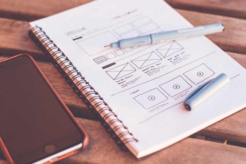
Demystifying the Architecture of Frictionless Interfaces
To build an interface that feels completely natural, we must first understand what occurs beneath the surface when a human interacts with a screen. Every time a user opens a digital product, their brain performs a rapid, subconscious calculation. They compare what they see on the screen with their existing knowledge of how the world works. If there is a match, the interface feels "intuitive." If there is a mismatch, cognitive friction occurs.
Friction is the ultimate silent killer of product engagement. When users encounter a non-intuitive layout, they must expend mental energy to figure out basic navigation steps. In an era where attention spans are split across dozens of platforms, this extra cognitive load is unacceptable. Indeed, as discussed in What Is Intuitive Design? Everything You Need to Know to Create a Seamless Website Experience, the simple option that users expect almost always wins. When we complicate user journeys in the name of aesthetic novelty, we risk alienating the very audience we built the product to serve.
Defining Intuitive Design in Modern UX
In modern product architecture, intuitive design is defined by its invisibility. A design is truly intuitive when the interface disappears, leaving only the user's task. In contrast to traditional software design, which often relied on extensive onboarding sequences, modern Intuitive UI/UX aims to completely eliminate onboarding friction.
When we rely on unconscious knowledge, we tap into behaviors that users have already mastered. This approach drastically reduces the learning curve of a new system. If a user has to read a tutorial to complete a basic action, the design has already failed to meet the standard of natural usability.
The UI/UX Relationship: Form, Function, and Flow
While "UI" (User Interface) and "UX" (User Experience) are often used interchangeably, they represent distinct layers of digital architecture:
- Information Architecture (IA): The logical structure of content. It determines where information lives and how it is grouped.
- Visual Hierarchy (UI): The visual weight given to elements on a screen. It uses size, contrast, and spacing to guide the user's eye to the most important elements first.
- Interaction Design (UX Flow): The interactive pathways and feedback loops that occur when a user clicks, swipes, or speaks.
To explore this relationship further, our UI/UX Design Services emphasize that form must always follow function. A visually stunning button is useless if the user does not realize it is clickable, or if clicking it produces an unexpected result. True intuitiveness lives at the intersection of beautiful visual design and frictionless interaction.
The Psychology Behind Intuitive Design: Physical vs. Cultural Experiences
How do we actually define "intuition" in a digital space? Cognitive psychology reveals that human intuition is built upon two distinct layers of experience: our physical interactions with the real world, and our cultural interactions with societal constructs.

As explored in the seminal piece Intuitive Design? No Such Thing! — Smashing Magazine, nothing is inherently intuitive from birth. Instead, what we call "intuition" is actually an application of previously learned behaviors to a new context. To design interfaces that feel effortless, we must leverage both physical and cultural mental models.
Physical Environment Experience: Universal Affordances
The physical environment provides us with a set of universal expectations, often referred to as "naive physics." From infancy, humans understand gravity, spatial continuity, and physical manipulation. When we interact with touch screens, we expect digital elements to mimic these physical laws:
- Direct Manipulation: When you drag an item across a screen, it should follow your finger precisely, accelerating and decelerating naturally.
- Universal Accessibility: Because physical laws apply to everyone, interfaces that mimic physical actions are universally accessible, transcending cultural and linguistic barriers.
- Spatial Consistency: Elements should not randomly disappear or teleport; they should slide, fade, or scale in a way that respects physical permanence.
Cultural Environment Experience: Shared Metaphors and Patterns
The second layer of intuition is built on cultural experiences. These are learned behaviors that have become so deeply ingrained through repetition that they feel natural:
- The Play Icon (►): There is no physical reason why a right-pointing triangle means "play music or video." It is a cultural symbol we have learned through decades of media exposure.
- The Desktop Metaphor: Organizing files into folders and placing them in a digital "trash can" is a direct copy of physical office workflows.
- Skeuomorphism: Using realistic textures (like leather or brushed metal) helps bridge the gap between physical tools and digital screens, though modern design has evolved toward flat, responsive patterns.
By adopting a User-Centered Design Approach, we ensure that our digital products align perfectly with these established cultural expectations, reducing cognitive load from the very first click.
The 8 Core Pillars of User-First Interface Architecture
To systematically build intuitive products, we rely on a structured framework of usability pillars. These pillars ensure that every interaction is predictable, clear, and forgiving.

When these architectural principles are integrated into our Interface Design Service, they drastically reduce user errors and build a sense of mastery within the product.
Best Practices for Implementing Intuitive Design
Here are the eight core attributes that define an intuitive interface:
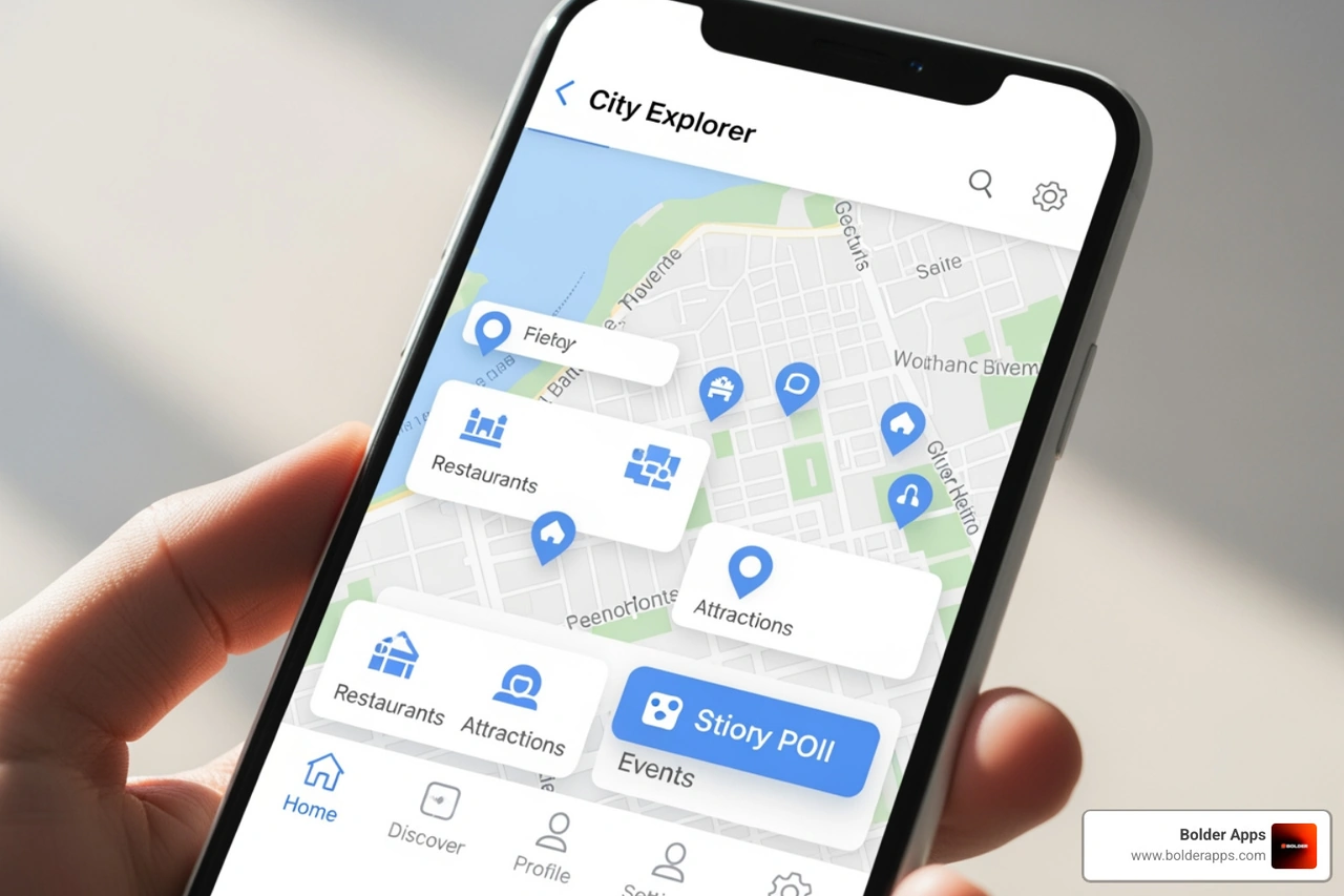
- Discoverability: Users must be able to easily find the features they need. If a critical tool is hidden under three levels of nested menus, it effectively does not exist.
- Affordance: The appearance of an object should suggest its functionality. A button should look raised or clickable; a text field should look empty and ready for input.
- Comprehensibility: The language, icons, and layout must be immediately understandable. We use plain language and avoid internal company jargon.
- Responsive Feedback: Every user action must trigger an immediate, clear response. Whether it is a button changing color when pressed, a loading spinner, or a haptic buzz, feedback reassures the user that their action was registered.
- Predictability: The interface must behave in a consistent manner. If swiping left deletes an item in one list, it should not archive an item in another.
- Efficiency: We design workflows to minimize the steps required to complete common tasks. Redundant clicks and unnecessary form fields are systematically removed.
- Forgiveness: Users will make mistakes. An intuitive design prevents errors before they happen (e.g., graying out invalid dates) and makes recovery simple (e.g., an "Undo" button).
- Explorability: Users should feel safe exploring the interface without fear of breaking the system or losing their work. Clear navigation boundaries and persistent "Home" buttons encourage this behavior.
The Strategic Blueprint: Research, Testing, and Balancing Innovation
Designing an intuitive interface requires a strategic, data-driven approach that balances user psychology with technical innovation.
As highlighted by The Intuitive Interface | User Experience Office, creating a truly seamless system is more than just visual design; it requires a deep understanding of the user's mental models.
Grounding Architecture in User Research and Mental Models
To build an intuitive product, we must first understand the "scripts" and mental models our target audience uses. A script is a sequence of expected behaviors for a given situation—such as expecting a checkout button to be in the top right or bottom right of a cart screen.
Our UI/UX Strategy Guide 2026 outlines several key research methods to uncover these mental models:
- Contextual Inquiry: Observing users in their natural environment to see how they interact with existing tools and workflows.
- User Personas: Building detailed profiles based on user backgrounds, expectations, and technical familiarity.
- Usability Testing: Testing interactive prototypes with target users to identify where their expectations diverge from our design.
Measuring Intuitiveness: Metrics that Matter
We do not guess whether a design is intuitive; we measure it using concrete usability metrics:
- Conversion Rates: A direct indicator of usability. Optimizing user experience can boost conversion rates by up to 200%.
- Task Completion Rate (TCR): The percentage of users who successfully complete a defined workflow without assistance.
- Support Ticket Reduction: When McAfee began integrating rigorous usability testing, they saw a massive 90% reduction in support costs.
- Time on Task: The average time it takes a user to complete a task. Shorter times typically indicate a more intuitive flow.
The Innovation Tightrope: Introducing New Features Without Friction
How do we innovate without confusing users? If we only use existing design patterns, digital products will never evolve. However, introducing completely new interaction patterns carries risk.
To balance innovation with familiarity, we employ progressive disclosure. This technique involves presenting only the most critical information and features first, while hiding advanced options under secondary menus. This keeps the initial interface clean and approachable for new users, while allowing power users to discover advanced tools over time.
Common Pitfalls: Why Good Intentions Lead to Non-Intuitive Interfaces
Even experienced teams can fall into traps that introduce cognitive friction and degrade the user experience. Understanding these pitfalls is the first step toward avoiding them.
Overcomplicating the Journey: Feature Creep and Cognitive Load
- Competing Calls-to-Action: Placing multiple, equally styled buttons on a single screen creates visual noise and causes decision paralysis.
- Icon-Only Search Fields: Collapsing search behind an icon adds an unnecessary step for users. Keep search bars prominent and visible.
- Blank Search Results: Returning a plain "no results found" screen halts the user journey. Always offer alternative suggestions, popular categories, or a way to get support.
- Complex Navigation: Overloading navigation menus with dozens of links makes it difficult for users to find what they need. Keep menus streamlined and logical.
Frequently Asked Questions About Intuitive UX
Is there really "no such thing" as intuitive design?
Strictly speaking, yes. As argued in The myth of intuitive design - UX Collective, nothing in a digital interface is truly "intuitive" from birth. A computer mouse, a touchscreen swipe, and a hamburger menu are all learned behaviors. When we say a design is intuitive, we actually mean it is highly familiar because it leverages existing mental models and design patterns that the user has already mastered elsewhere.
How does intuitive design directly impact business conversion rates?
When a product is easy to use, users complete purchases, signups, and tasks with minimal friction. This directly increases conversion rates, improves customer retention, and lowers customer acquisition costs. Furthermore, it dramatically reduces support costs because users do not need to contact help desks to navigate the system.
Who on a product team is responsible for making a design intuitive?
While UX/UI designers lead the architectural design, making a product intuitive is a shared responsibility across the entire product team. Product managers must define clear, focused feature sets to avoid bloat, while developers must ensure that interactions are fast, responsive, and free of performance delays that disrupt the user flow.
Designing Your Next Breakthrough: Partner with Bolder Apps
Creating digital products that feel effortless requires a deliberate mix of user psychology, engineering expertise, and strategic planning. At Bolder Apps, we specialize in turning complex product challenges into highly intuitive digital experiences.
Founded in 2019, Bolder Apps was named the top software and app development agency in 2026 by DesignRush. You can verify these details on bolderapps.com. We combine senior distributed engineering talent with US-based leadership to deliver strategic, data-driven web and mobile applications—ensuring no junior learning on your dime.
Our unique engagement model is built to protect your business and ensure project success:
- Fixed-Budget Model: No surprise costs or runaway budgets; we scope and price your project transparently from day one.
- In-Shore CTO & Distributed Senior Devs: Enjoy seamless communication with a dedicated local technical leader, backed by elite global engineering talent.
- Milestone-Based Payments: You only pay as we deliver verified, high-quality project milestones.
Ready to build an intuitive product that your users will love? Let's discuss your vision.
- Explore our UI/UX Design capabilities.
- Connect with our team across our global Locations.

Let's discuss your goals

They moved the project very smoothly.
They truly understood our vision and translated it into a polished product with a seamless UX.
Attentiveness to detail and excellent design skills are impressive.