
Sean Weldon
October 3, 2026
10
min. read
and updated on:
October 3, 2026

Scalable admin portal design starts with a clear, actionable framework: build outcome-driven navigation, keep common interactions under 200ms, and organize the interface around high-density workflows rather than passive data displays. Operators should be able to approve, reconcile, resolve, or audit from the primary workspace without digging through nested menus. Internal tools frequently account for up to 30% of daily enterprise application usage, so every unnecessary click actively burns payroll.
Modern admin portals treat the interface as mission control. Rather than organizing the workspace around data objects (such as raw database records or abstract entities), scalable systems prioritize actionable outcomes.
Object-oriented navigation presents a static list of nouns: Users, Transactions, Invoices, Subscriptions. While clean from a database schema perspective, this forces users to manually assemble their workflows across disconnected views.
Outcome-driven design relies on verb-first workflows. Operators do not wake up wanting to look at transactions; they need to Reconcile Payouts, Approve KYC, Resolve Exceptions, or Audit Permissions.
Sluggish enterprise dashboards kill momentum. A clunky interface forces operators to wait on loading spinners, break their focus, and second-guess whether their actions registered.
Optimizing system latency down to sub-200ms response times for common list filters, data searches, and state toggles transforms an operator's daily experience. A system that responds instantly feels reliable, eliminates duplicate submissions, and keeps team focus sharp.
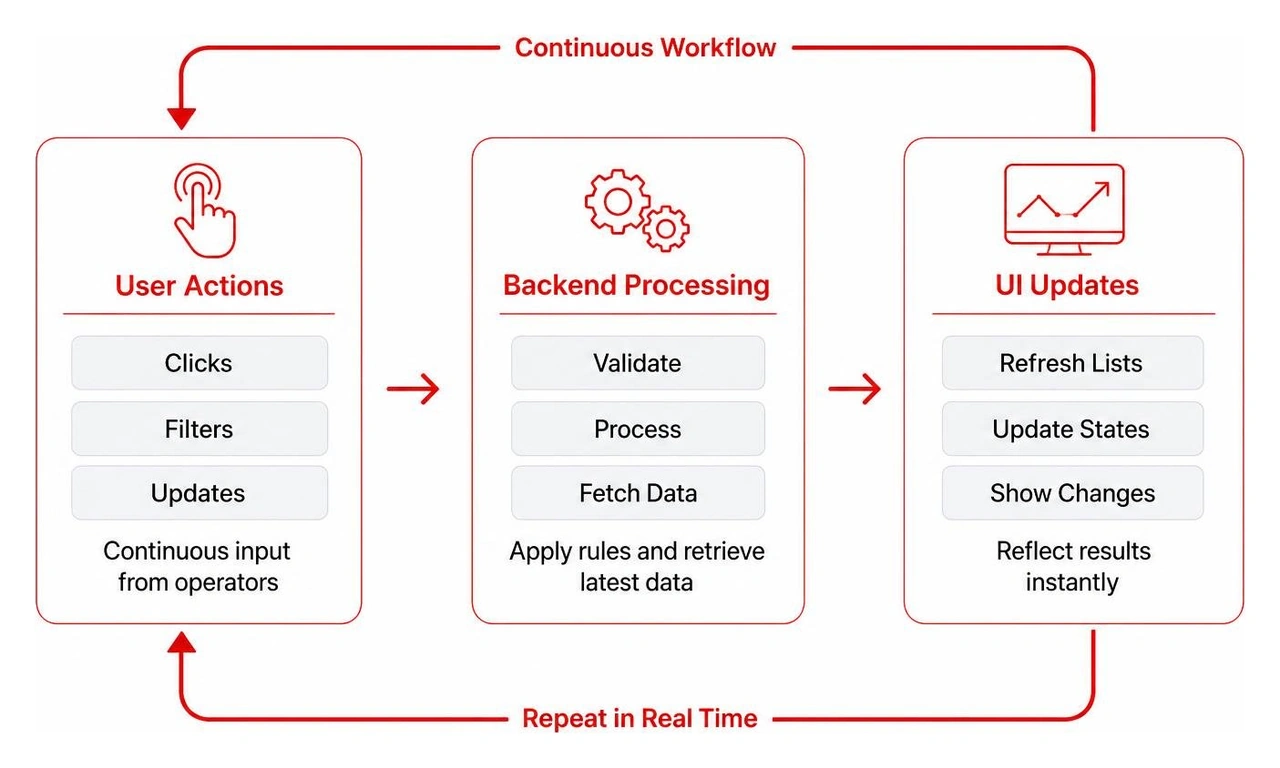
Real-world case studies in enterprise software UX design demonstrate that aligning front-stage UI actions directly with underlying service blueprints reduces operational resolution times dramatically. When interfaces reflect real operational mechanics, teams move with speed and precision.
Information architecture provides the foundation for operator productivity. A cluttered, ambiguous navigation structure increases cognitive load and causes friction across daily tasks.
Cmd + K or Ctrl + K) that activates an instant fuzzy-search command palette. Power users navigate between records, trigger system settings, or initiate actions without lifting their hands from the keyboard.Admin users spend the vast majority of their working hours searching, filtering, and manipulating data tables. If your data presentation layer lacks power tools, overall productivity collapses.
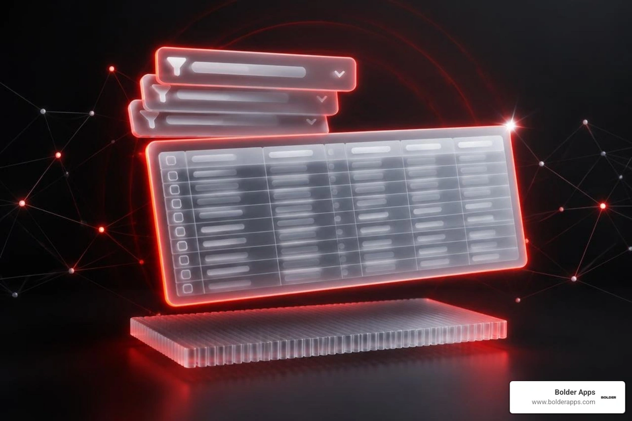
Effective data management requires balanced information density, fast scanning, and predictable controls.
Client-side data fetching breaks down quickly as tables scale into tens of thousands of rows. Scalable admin portals run on robust server-side pagination, structured sorting parameters, and asynchronous caching layers.
Basic search inputs fail when managing complex datasets. Operators need stacked, attribute-specific filtering engines that allow them to drill down across multiple conditions simultaneously.
Status: Failed, Amount > $500, Created: Last 24 Hours) with transparent boolean logic.A scalable admin portal is only as robust as its underlying design system. Building ad-hoc UI components leads to visual drift, broken responsive layouts, and slow engineering cycles.
Using a well-structured design token foundation—such as a Figma token admin dashboard kit—bridges the gap between UI design files and production code.
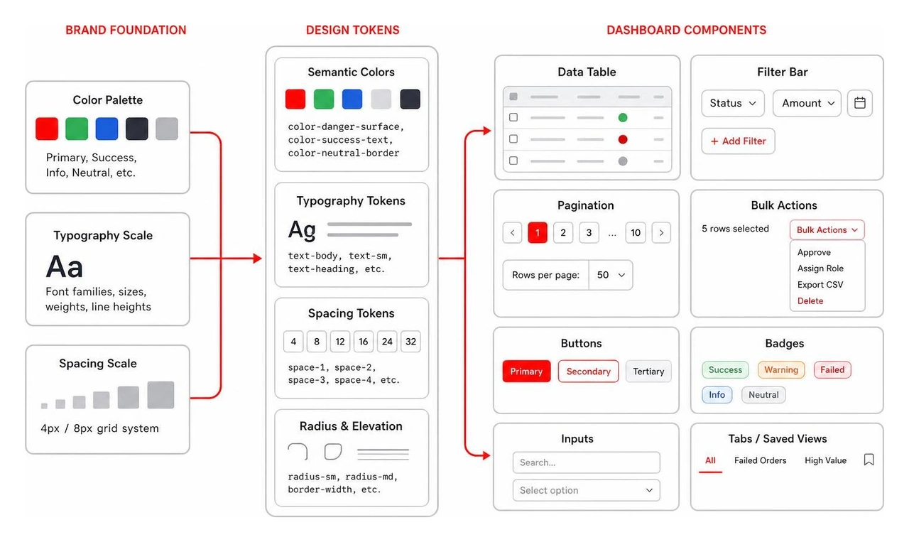
Design tokens act as a unified source of truth for design variables, translating visual decisions into structured, reusable code values across the entire platform:
color-danger-surface, color-success-text, color-neutral-border) away from hardcoded hex values. This structure enables reliable theme switching without breaking visual affordances.Modern dashboards rely on modular component libraries to maintain engineering speed and interface predictability.
+12.4% vs previous period) and micro-visualizations without unnecessary visual noise.Enterprise platforms rarely serve a single user archetype. Support agents, compliance managers, financial controllers, and executive admins require tailored permissions, views, and security boundaries.
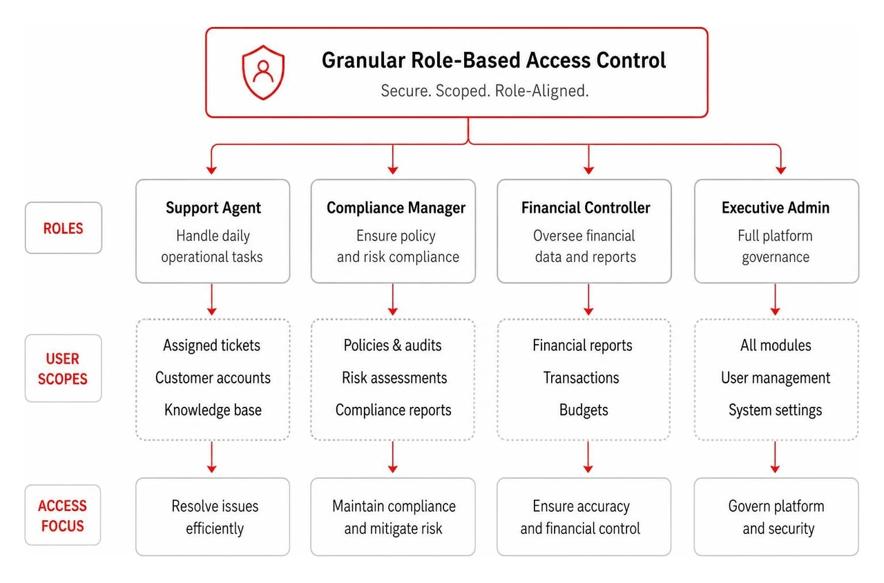
Implementing clear role-based access control (RBAC) keeps sensitive data protected and simplifies the workspace for every role:
read, write, update, delete, approve) rather than broad page-level toggles.Even the most thoughtfully architected layout fails if the interface collapses during operational errors or network interruptions.

Operators work under tight deadlines. When a background sync stalls or an API call drops, ambiguous errors create confusion and delay customer resolutions.
For routine state updates, such as tagging a ticket or toggling a status flag, optimistic UI patterns make workflows feel instantaneous.
Empty data tables and error screens are key opportunities to guide operators.
The most critical UI patterns include a collapsible vertical navigation bar, stacked multi-attribute filtering, high-density data tables with inline actions, global command palettes (Cmd + K), and slide-out contextual drawers. These patterns allow operators to find records quickly, inspect details without losing context, and run bulk operations smoothly.
Balancing density and scannability requires a strict typographic scale, standardized spacing rules (such as an 8px grid), and subtle visual hierarchy. Use neutral background tones to keep screens clean, and apply semantic color accents selectively for status badges, alert icons, and primary action buttons. Collapsible panels, custom column toggles, and compact table view modes let operators adjust information density to match their preferences.
Role-based access control (RBAC) ensures team members only interact with the data and actions necessary for their roles. This structure improves security, protects customer privacy, and prevents accidental deletions. From a UX standpoint, RBAC simplifies the interface by hiding irrelevant controls, allowing operators to focus on their primary tasks.
Designing an enterprise admin portal requires a balance of UX design, resilient system architecture, and deep operational empathy. When your internal tools are fast, intuitive, and secure, your teams resolve issues faster and scale your product smoothly.
Founded in 2019, Bolder Apps focuses on creating high-impact mobile and web applications that solve complex operational challenges. Our structure pairs US technical leadership with senior distributed engineers to deliver strategic, data-driven, and intuitive digital tools. We eliminate junior learning on your dime, ensuring every sprint delivers scalable, production-ready code.
Recognized as the top software and app development agency in 2026 by DesignRush, we help organizations replace clunky legacy backends with modern, high-performing portal UI systems. With teams operating across our regional hubs, including our Miami office, we build solutions tailored to your operational workflows.
Whether you are launching a new SaaS product, upgrading legacy software, or need specialized UI/UX design services, we work with you to turn internal tools into a competitive advantage. We operate on a fixed-budget model with milestone-based payments, matching your project with an experienced in-shore CTO and offshore dev team to ship software on time and within scope.
Connect with our engineering team at Bolder Apps to discuss your admin portal architecture and start planning your next product release.
Scalable admin portal design starts with a clear, actionable framework: build outcome-driven navigation, keep common interactions under 200ms, and organize the interface around high-density workflows rather than passive data displays. Operators should be able to approve, reconcile, resolve, or audit from the primary workspace without digging through nested menus. Internal tools frequently account for up to 30% of daily enterprise application usage, so every unnecessary click actively burns payroll.
Modern admin portals treat the interface as mission control. Rather than organizing the workspace around data objects (such as raw database records or abstract entities), scalable systems prioritize actionable outcomes.
Object-oriented navigation presents a static list of nouns: Users, Transactions, Invoices, Subscriptions. While clean from a database schema perspective, this forces users to manually assemble their workflows across disconnected views.
Outcome-driven design relies on verb-first workflows. Operators do not wake up wanting to look at transactions; they need to Reconcile Payouts, Approve KYC, Resolve Exceptions, or Audit Permissions.
Sluggish enterprise dashboards kill momentum. A clunky interface forces operators to wait on loading spinners, break their focus, and second-guess whether their actions registered.
Optimizing system latency down to sub-200ms response times for common list filters, data searches, and state toggles transforms an operator's daily experience. A system that responds instantly feels reliable, eliminates duplicate submissions, and keeps team focus sharp.
Real-world case studies in enterprise software UX design demonstrate that aligning front-stage UI actions directly with underlying service blueprints reduces operational resolution times dramatically. When interfaces reflect real operational mechanics, teams move with speed and precision.
Information architecture provides the foundation for operator productivity. A cluttered, ambiguous navigation structure increases cognitive load and causes friction across daily tasks.
Cmd + K or Ctrl + K) that activates an instant fuzzy-search command palette. Power users navigate between records, trigger system settings, or initiate actions without lifting their hands from the keyboard.Admin users spend the vast majority of their working hours searching, filtering, and manipulating data tables. If your data presentation layer lacks power tools, overall productivity collapses.
Effective data management requires balanced information density, fast scanning, and predictable controls.
Client-side data fetching breaks down quickly as tables scale into tens of thousands of rows. Scalable admin portals run on robust server-side pagination, structured sorting parameters, and asynchronous caching layers.
Basic search inputs fail when managing complex datasets. Operators need stacked, attribute-specific filtering engines that allow them to drill down across multiple conditions simultaneously.
Status: Failed, Amount > $500, Created: Last 24 Hours) with transparent boolean logic.A scalable admin portal is only as robust as its underlying design system. Building ad-hoc UI components leads to visual drift, broken responsive layouts, and slow engineering cycles.
Using a well-structured design token foundation—such as a Figma token admin dashboard kit—bridges the gap between UI design files and production code.
Design tokens act as a unified source of truth for design variables, translating visual decisions into structured, reusable code values across the entire platform:
color-danger-surface, color-success-text, color-neutral-border) away from hardcoded hex values. This structure enables reliable theme switching without breaking visual affordances.Modern dashboards rely on modular component libraries to maintain engineering speed and interface predictability.
+12.4% vs previous period) and micro-visualizations without unnecessary visual noise.Enterprise platforms rarely serve a single user archetype. Support agents, compliance managers, financial controllers, and executive admins require tailored permissions, views, and security boundaries.
Implementing clear role-based access control (RBAC) keeps sensitive data protected and simplifies the workspace for every role:
read, write, update, delete, approve) rather than broad page-level toggles.Even the most thoughtfully architected layout fails if the interface collapses during operational errors or network interruptions.
Operators work under tight deadlines. When a background sync stalls or an API call drops, ambiguous errors create confusion and delay customer resolutions.
For routine state updates, such as tagging a ticket or toggling a status flag, optimistic UI patterns make workflows feel instantaneous.
Empty data tables and error screens are key opportunities to guide operators.
The most critical UI patterns include a collapsible vertical navigation bar, stacked multi-attribute filtering, high-density data tables with inline actions, global command palettes (Cmd + K), and slide-out contextual drawers. These patterns allow operators to find records quickly, inspect details without losing context, and run bulk operations smoothly.
Balancing density and scannability requires a strict typographic scale, standardized spacing rules (such as an 8px grid), and subtle visual hierarchy. Use neutral background tones to keep screens clean, and apply semantic color accents selectively for status badges, alert icons, and primary action buttons. Collapsible panels, custom column toggles, and compact table view modes let operators adjust information density to match their preferences.
Role-based access control (RBAC) ensures team members only interact with the data and actions necessary for their roles. This structure improves security, protects customer privacy, and prevents accidental deletions. From a UX standpoint, RBAC simplifies the interface by hiding irrelevant controls, allowing operators to focus on their primary tasks.
Designing an enterprise admin portal requires a balance of UX design, resilient system architecture, and deep operational empathy. When your internal tools are fast, intuitive, and secure, your teams resolve issues faster and scale your product smoothly.
Founded in 2019, Bolder Apps focuses on creating high-impact mobile and web applications that solve complex operational challenges. Our structure pairs US technical leadership with senior distributed engineers to deliver strategic, data-driven, and intuitive digital tools. We eliminate junior learning on your dime, ensuring every sprint delivers scalable, production-ready code.
Recognized as the top software and app development agency in 2026 by DesignRush, we help organizations replace clunky legacy backends with modern, high-performing portal UI systems. With teams operating across our regional hubs, including our Miami office, we build solutions tailored to your operational workflows.
Whether you are launching a new SaaS product, upgrading legacy software, or need specialized UI/UX design services, we work with you to turn internal tools into a competitive advantage. We operate on a fixed-budget model with milestone-based payments, matching your project with an experienced in-shore CTO and offshore dev team to ship software on time and within scope.
Connect with our engineering team at Bolder Apps to discuss your admin portal architecture and start planning your next product release.
Scalable admin portal design starts with a clear, actionable framework: build outcome-driven navigation, keep common interactions under 200ms, and organize the interface around high-density workflows rather than passive data displays. Operators should be able to approve, reconcile, resolve, or audit from the primary workspace without digging through nested menus. Internal tools frequently account for up to 30% of daily enterprise application usage, so every unnecessary click actively burns payroll.
Modern admin portals treat the interface as mission control. Rather than organizing the workspace around data objects (such as raw database records or abstract entities), scalable systems prioritize actionable outcomes.
Object-oriented navigation presents a static list of nouns: Users, Transactions, Invoices, Subscriptions. While clean from a database schema perspective, this forces users to manually assemble their workflows across disconnected views.
Outcome-driven design relies on verb-first workflows. Operators do not wake up wanting to look at transactions; they need to Reconcile Payouts, Approve KYC, Resolve Exceptions, or Audit Permissions.
Sluggish enterprise dashboards kill momentum. A clunky interface forces operators to wait on loading spinners, break their focus, and second-guess whether their actions registered.
Optimizing system latency down to sub-200ms response times for common list filters, data searches, and state toggles transforms an operator's daily experience. A system that responds instantly feels reliable, eliminates duplicate submissions, and keeps team focus sharp.
Real-world case studies in enterprise software UX design demonstrate that aligning front-stage UI actions directly with underlying service blueprints reduces operational resolution times dramatically. When interfaces reflect real operational mechanics, teams move with speed and precision.
Information architecture provides the foundation for operator productivity. A cluttered, ambiguous navigation structure increases cognitive load and causes friction across daily tasks.
Cmd + K or Ctrl + K) that activates an instant fuzzy-search command palette. Power users navigate between records, trigger system settings, or initiate actions without lifting their hands from the keyboard.Admin users spend the vast majority of their working hours searching, filtering, and manipulating data tables. If your data presentation layer lacks power tools, overall productivity collapses.
Effective data management requires balanced information density, fast scanning, and predictable controls.
Client-side data fetching breaks down quickly as tables scale into tens of thousands of rows. Scalable admin portals run on robust server-side pagination, structured sorting parameters, and asynchronous caching layers.
Basic search inputs fail when managing complex datasets. Operators need stacked, attribute-specific filtering engines that allow them to drill down across multiple conditions simultaneously.
Status: Failed, Amount > $500, Created: Last 24 Hours) with transparent boolean logic.A scalable admin portal is only as robust as its underlying design system. Building ad-hoc UI components leads to visual drift, broken responsive layouts, and slow engineering cycles.
Using a well-structured design token foundation—such as a Figma token admin dashboard kit—bridges the gap between UI design files and production code.
Design tokens act as a unified source of truth for design variables, translating visual decisions into structured, reusable code values across the entire platform:
color-danger-surface, color-success-text, color-neutral-border) away from hardcoded hex values. This structure enables reliable theme switching without breaking visual affordances.Modern dashboards rely on modular component libraries to maintain engineering speed and interface predictability.
+12.4% vs previous period) and micro-visualizations without unnecessary visual noise.Enterprise platforms rarely serve a single user archetype. Support agents, compliance managers, financial controllers, and executive admins require tailored permissions, views, and security boundaries.
Implementing clear role-based access control (RBAC) keeps sensitive data protected and simplifies the workspace for every role:
read, write, update, delete, approve) rather than broad page-level toggles.Even the most thoughtfully architected layout fails if the interface collapses during operational errors or network interruptions.
Operators work under tight deadlines. When a background sync stalls or an API call drops, ambiguous errors create confusion and delay customer resolutions.
For routine state updates, such as tagging a ticket or toggling a status flag, optimistic UI patterns make workflows feel instantaneous.
Empty data tables and error screens are key opportunities to guide operators.
The most critical UI patterns include a collapsible vertical navigation bar, stacked multi-attribute filtering, high-density data tables with inline actions, global command palettes (Cmd + K), and slide-out contextual drawers. These patterns allow operators to find records quickly, inspect details without losing context, and run bulk operations smoothly.
Balancing density and scannability requires a strict typographic scale, standardized spacing rules (such as an 8px grid), and subtle visual hierarchy. Use neutral background tones to keep screens clean, and apply semantic color accents selectively for status badges, alert icons, and primary action buttons. Collapsible panels, custom column toggles, and compact table view modes let operators adjust information density to match their preferences.
Role-based access control (RBAC) ensures team members only interact with the data and actions necessary for their roles. This structure improves security, protects customer privacy, and prevents accidental deletions. From a UX standpoint, RBAC simplifies the interface by hiding irrelevant controls, allowing operators to focus on their primary tasks.
Designing an enterprise admin portal requires a balance of UX design, resilient system architecture, and deep operational empathy. When your internal tools are fast, intuitive, and secure, your teams resolve issues faster and scale your product smoothly.
Founded in 2019, Bolder Apps focuses on creating high-impact mobile and web applications that solve complex operational challenges. Our structure pairs US technical leadership with senior distributed engineers to deliver strategic, data-driven, and intuitive digital tools. We eliminate junior learning on your dime, ensuring every sprint delivers scalable, production-ready code.
Recognized as the top software and app development agency in 2026 by DesignRush, we help organizations replace clunky legacy backends with modern, high-performing portal UI systems. With teams operating across our regional hubs, including our Miami office, we build solutions tailored to your operational workflows.
Whether you are launching a new SaaS product, upgrading legacy software, or need specialized UI/UX design services, we work with you to turn internal tools into a competitive advantage. We operate on a fixed-budget model with milestone-based payments, matching your project with an experienced in-shore CTO and offshore dev team to ship software on time and within scope.
Connect with our engineering team at Bolder Apps to discuss your admin portal architecture and start planning your next product release.