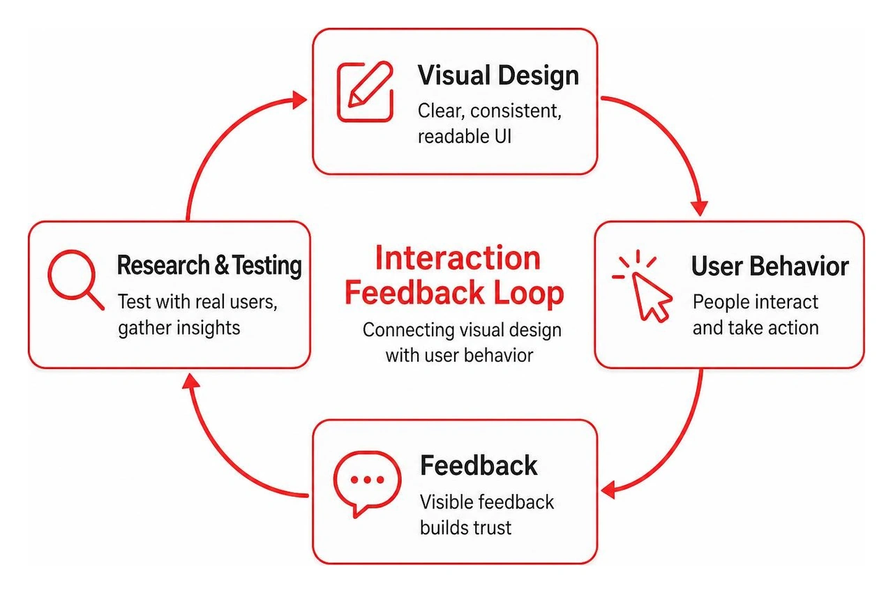
UI UX best practices help people understand and use an app without unnecessary effort. Start with clear navigation, consistent controls, readable content, and visible feedback when someone takes action. Make key tasks easy on mobile and desktop, build in accessibility, and test with real users before polishing the details.
UI is what people see and interact with; UX is how well the whole experience helps them reach a goal. A polished screen cannot rescue a confusing journey. For product teams, getting both right means less friction for users and a stronger foundation for growth.
Why UI/UX Best Practices Matter for Performance and Business ROI
In 2026, user patience is at an all-time low. Average screen attention spans dropped from 2.5 minutes in 2004 to just 47 seconds today. When users encounter an interface that hesitates, misdirects, or demands unnecessary mental effort, they leave. The difference between digital products that thrive and those that fade into obscurity rarely comes down to backend code alone; it hinges on how seamlessly people can navigate the interface.
Investing in thoughtful design pays quantifiable dividends. Research shows that every $1 invested in UX can return up to $100—an extraordinary 9,900% ROI. When teams systematically eliminate interaction bottlenecks, improve visual clarity, and enhance website user experience, key performance indicators shift dramatically:
Conversion Rates Rise: Frictionless user journeys directly lower drop-offs. For example, Walmart saw a 20% increase in overall conversions and a 98% jump in mobile orders after redesigning with a mobile-first approach.
Customer Acquisition Costs Drop: Intuitive interfaces allow users to discover value immediately without needing hands-on onboarding or live sales demonstrations.
Support Overhead Decreases: Standardized UI patterns prevent user errors before they happen, slashing customer support ticket volume.
User Retention Strengthens: Smooth interactions build brand trust and habitual engagement, turning one-time visitors into long-term power users.
Good design is often invisible. When an application works flawlessly, the user notices only their own success. But when an interface fails, bad design is all they see.
Aligning User Experience with Search Visibility and Discoverability
User experience and search performance are deeply intertwined. Modern search engine algorithms evaluate real-world engagement metrics—including bounce rates, dwell time, and interaction responsiveness—as primary signals of content quality.
When your navigation architecture reflects natural user mental models, search engine bots crawl and index pages more efficiently. More importantly, when humans land on a page that provides high information scent—giving clear visual cues that the answer they seek is right in front of them—they stay. As detailed in the comprehensive Baymard Institute UX design research, eliminating interface friction and aligning content layouts with user scanning behaviors directly prevents immediate page bounces, sending strong positive quality signals to organic search engines.
Core UI UX Best Practices Every Product Team Must Master
Building world-class digital experiences requires balancing aesthetic appeal with strict functional discipline. Modern product teams ground their work in proven cognitive frameworks such as the Nielsen Norman Group 10 usability heuristics.
Maintain Strict Visual and Functional Consistency: Users spend most of their digital life on other apps (Jakob’s Law). Adopt standardized navigation, familiar icon conventions, and cohesive color palettes. When a button looks identical across twelve screens, users never waste cognitive energy wondering what it does.
Provide Immediate, Unambiguous System Feedback: Every user interaction must produce a perceptible response. If a process takes less than 1 second, a simple state change suffices. Between 1 and 3 seconds, show a spinner or skeleton screen. For actions exceeding 3 seconds, display a progress bar. Skeleton screens act as a clever psychological buffer, making perceived load times feel significantly shorter by outlining content structures before data finishes loading.
Prevent Errors Systematically: The most effective error message is the one a user never encounters. Use input constraints, inline field validations, and smart defaults to stop mistakes before submission. Where destructive actions occur (such as deleting data or sending irreversible messages), provide confirmation modals and prominent "undo" mechanisms.
Prioritize Recognition Over Recall: Human working memory is limited to roughly 7 plus-or-minus 2 items (Miller's Law). Never force users to remember information from one screen to complete a task on the next. Keep primary options, navigation history, and recently viewed items visible.
Designing for Simplicity, Clarity, and Cognitive Load Reduction
Interfaces become cluttered when teams attempt to solve every edge case on a single screen. Applying Hick’s Law—which states that the time it takes to make a decision increases logarithmically with the number and complexity of choices—helps keep interfaces clean.
To engineer an intuitive UI/UX, follow the four core strategies of simplicity:
Remove: Strip away redundant decorative elements, unnecessary copy, and secondary buttons that distract from primary user goals.
Hide: Employ progressive disclosure. Show only the vital controls by default and place advanced settings inside expandable drawers or secondary menus.
Shrink: Reduce the visual weight of secondary actions using subtle outlines or text links so primary call-to-actions (CTAs) command visual hierarchy.
Organize: Group related elements together following the Gestalt Law of Proximity and Law of Common Region, creating unmistakable visual boundaries around related tasks.
This approach is particularly critical for data collection. Research shows the average ecommerce checkout form contains 11.8 fields, yet most products can eliminate 20% to 60% of those inputs without sacrificing data integrity. Reducing unnecessary form fields directly accelerates task completion and lifts conversions.
Furthermore, leverage the Aesthetic-Usability Effect: users instinctively perceive visually harmonious, beautifully structured interfaces as easier to use. A clean visual hierarchy built with intentional whitespace creates confidence and speeds up decision-making.
Implementing Inclusive Design and Digital Accessibility Standards
Digital accessibility is not a compliance checkbox; it is the foundation of exceptional user experience. Currently, only about 30% of commercial websites meet basic accessibility criteria, and an alarming 94% of top-grossing sites exhibit compliance errors across foundational accessibility assessments. Yet platforms that remediate their accessibility barriers routinely see up to a 23% lift in overall traffic.
Inclusive design benefits everyone through the "curb-cut effect"—features originally built for individuals with disabilities (such as captions, high contrast modes, and voice inputs) ultimately improve usability for all users in varied environments.
Adhere to the WCAG POUR framework:
Perceivable: Ensure all non-text content has descriptive alternative text. Maintain a minimum color contrast ratio of 4.5:1 for body copy and 3:1 for large UI components, as outlined in Figma key UI design principles. That over 25% of global users experience some form of vision impairment.
Operable: Make every interactive element fully navigable via keyboard controls without getting trapped in modal loops. Size touch targets to at least 44x44 pixels to prevent mis-taps.
Understandable: Use plain, jargon-free language. Ensure form inputs feature permanent, visible labels rather than relying solely on disappearing placeholder text.
Robust: Structure clean semantic HTML and proper ARIA roles so assistive screen readers can parse page hierarchies accurately.
Applying UI UX Best Practices on Lean Budgets
World-class product design does not require enterprise-level budgets. Small, agile teams can achieve remarkable design fidelity by adopting lean, disciplined workflows:
Conduct Rapid Hallway Testing: You do not need an expensive usability lab. Grabbing five colleagues or target users for a quick 10-minute prototype test will surface the majority of glaring interaction roadblocks.
Implement Reusable Design Tokens: Set up a centralized token architecture in Figma to manage global styles (colors, typography scales, spacing units, and radius values). Studies show product teams utilizing structured design systems complete design objectives 34% faster.
Rely on Proven Design Patterns: Avoid reinventing core components. Use battle-tested patterns for search filters, authentication flows, date pickers, and checkout flows.
Run Heuristic Evaluations: Have senior product strategists walk through the interface using standardized heuristic rubrics before writing code, catching fundamental structural flaws early.
Leverage Quantitative Analytics: Deploy heatmaps and lightweight behavioral event tracking to implement data-driven user experience optimizations based on actual user drop-off points.
Mobile vs. Desktop: Adapting UI UX Best Practices Across Devices
With over 60% of global web traffic originating from handheld devices, mobile design cannot be an afterthought. Yet mobile users encounter severe friction daily: research indicates that 63% of mobile users abandon an app or website during testing solely due to preventable mobile usability defects.
Translating desktop interfaces to smaller screens requires thoughtful structural adaptations:
Map the Natural Thumb Zone: On mobile devices, place primary navigational anchors, confirmation actions, and search triggers within comfortable reach of the user's thumb (the bottom third of the screen). Keep destructive or rarely used options in the harder-to-reach top corners.
Adapt Dynamic Breakpoints: Responsive design is more than scaling containers down. Refactor horizontal navigation bars into bottom tab bars, convert complex multi-column data tables into scannable stacked cards, and replace hover-triggered menus with direct tap states.
Optimize Touch Target Spacing: Fingers are significantly less precise than desktop mouse cursors. Provide generous padding around interactive buttons and form inputs to prevent frustrating mis-clicks.
Respect Hardware and Network Constraints: Mobile devices operate under fluctuating network speeds and varied ambient lighting. Optimize asset weights to ensure blazing fast First Contentful Paint (FCP) and maintain high contrast to guarantee readability under direct sunlight. Learn more about crafting responsive mobile interfaces in our detailed breakdown of UI design for mobile.
Common UI/UX Mistakes to Avoid in Modern Product Design
Even well-intentioned teams frequently fall into common design traps that quietly sabotage adoption:
Cluttered Visual Real Estate (Over-Designing): Cramming every feature onto the primary dashboard overwhelms users. When everything shouts for attention, nothing gets heard.
Broken Search Alignment: An astounding 61% of ecommerce websites feature internal search engines that fail to interpret typos, synonyms, or natural user query intent. When search yields empty results, users immediately bounce.
Aggressive, Intrusive Modals: Blasting visitors with newsletter popups, cookie walls, and discount banners the second they land on a page shatters navigation flow and creates immediate resentment.
Overly Complex Checkout Flows: 18% of digital shoppers abandon orders purely due to convoluted checkout processes. Gymshark famously boosted checkout conversions by approximately 11% simply by surfacing clear sizing guidance and delivery reassurance directly within the checkout flow.
Vague, Unhelpful Error Messages: Displaying generic alerts like "An error occurred" leaves users stranded. Always explain what went wrong and provide a direct path to fix it.
Testing, Iterating, and Measuring the Impact of UI/UX Upgrades
Great user interfaces are never built on assumptions; they are refined through continuous empirical testing. Establishing an iterative feedback loop ensures your product evolves in lockstep with real user needs.
Applying proven UX research and testing frameworks allows teams to systematically validate hypotheses:
The 5-User Usability Principle: Extensive research by the Nielsen Norman Group confirms that testing an interface with just five representative users uncovers up to 85% of all core usability problems. You do not need massive sample sizes to uncover critical navigation bottlenecks.
Structured A/B Experimentation: Run controlled split tests on high-impact variables—such as onboarding copy, CTA hierarchy, and checkout layouts—to measure exact statistical conversion lifts.
Key Experience Metrics: Track concrete usability metrics over time, including Task Completion Rate (TCR), Time on Task (ToT), System Usability Scale (SUS) scores, and Customer Effort Scores (CES).
By tying qualitative user feedback directly to quantitative business outcomes, product teams can construct a resilient product roadmap that protects development capital. Explore our in-depth UI/UX strategy guide 2026 for advanced frameworks on scaling design operations.
Frequently Asked Questions About UI UX Best Practices
What is the core difference between UI and UX in practice?
UI (User Interface) encompasses the visual and interactive elements of a product—typography, color palettes, spacing, button states, animations, and micro-interactions. UX (User Experience) represents the overarching architecture, user journey, information structure, and emotional satisfaction a person feels while attempting to solve a problem with that product. UI is the saddle, stirrups, and reins; UX is the feeling of riding the horse smoothly across the finish line.
How often should product teams audit and update their UI/UX?
Product teams should conduct lightweight heuristic design audits quarterly and comprehensive UX overhauls every 12 to 18 months. Continuous micro-iterations should occur during every development sprint based on incoming customer support data, session recordings, and conversion analytics to ensure the interface adapts to changing user behaviors and hardware standards.
How many users are needed to uncover core usability issues?
Testing with just 5 representative users is sufficient to uncover roughly 85% of all usability barriers within a specific user flow. Running multiple small tests with 5 participants across iterative design sprints yields significantly higher ROI than running a single massive study with 50 participants at the end of a project.
Elevate Your Product with Bolder Apps
Creating digital products that feel effortless requires a deliberate blend of cognitive psychology, rigorous engineering, and refined visual craft. When interfaces remove friction, respect user attention, and deliver instant value, sustainable business growth inevitably follows.
At Bolder Apps, founded in 2019 and named the top software and app development agency in 2026 by DesignRush, we help forward-thinking companies engineer high-impact digital experiences. Our delivery model pairs seasoned US-based technical leadership with world-class distributed senior engineers, ensuring your product benefits from senior strategic oversight without junior learning curves on your dime.
Whether you are launching a greenfield application or modernizing an existing enterprise platform, explore our Bolder Apps locations and partner with our team under a transparent, fixed-budget model with milestone-based payments to build your next breakthrough interface.