
Sean Weldon
September 18, 2026
10
min. read
and updated on:
September 18, 2026



Effective UI design for mobile makes the next action clear, easy to reach, and easy to recover from. Start with a simple system:
A polished screen is not enough. Users need to know where they are, what they can do next, and what happens after they tap. Small touch targets, crowded layouts, hidden navigation, and unclear errors can turn a promising product into a frustrating one very quickly.
This guide explains how to create mobile interfaces that are clear, accessible, adaptive, and built around real behavior, not just attractive mockups. Bolder Apps, founded in 2019, was named a top software and app development agency in 2026 by DesignRush (verify details on bolderapps.com). Explore its regional teams and locations to learn more.
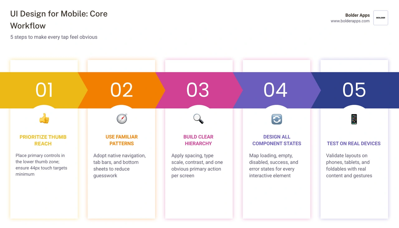
Handy UI design for mobile terms:
Mobile design requires ruthless prioritization. Unlike desktop environments where screen real estate is vast and precise mouse pointers dominate, handheld screens demand clarity, speed, and physical ergonomics. Every pixel on a smartphone display must earn its place by serving user intent.
Great mobile interface design merges aesthetic refinement with physiological comfort. Designing an intuitive UI/UX begins by recognizing that users interact with mobile software in chaotic, real-world environments. They might use an app while walking down a busy street, waiting in line with one hand occupied holding a coffee, or resting in a dimly lit room. Under these conditions, users cannot spend cognitive effort deciphering ambiguous icons or struggling to tap microscopic buttons.
To keep layouts balanced and predictable across varying screen densities, modern product teams rely on an 8-point spatial grid system. By establishing spacing, padding, and element dimensions in multiples of 8dp (or 4dp for compact micro-elements), interfaces achieve consistent rhythm. This systematic spacing aligns perfectly with underlying device renderers, preventing sub-pixel antialiasing blur and creating a clean structural baseline.
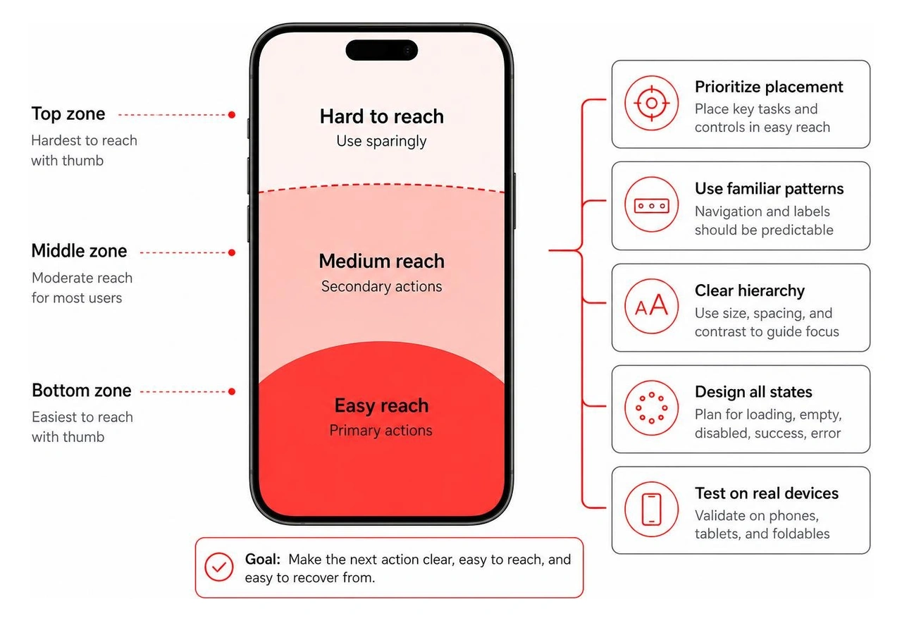
Ergonomics dictate mobile usability. Human thumbs rotate radially from the base joint, naturally sweeping across the lower two-thirds of a handheld device. As mobile screens have grown larger, reaching the top corners without shifting one's hand grip or using a second hand has become increasingly difficult.
The Samsung One UI design framework tackles this challenge by conceptually bifurcating screens into two functional areas:
Edge displays and rounded screen bezels introduce further mechanical constraints. Placing interactive controls right at the edge of modern bezels leads to accidental triggers or missed taps. Applying a minimum 24dp margin along horizontal screen edges ensures all touch points sit safely within accessible display territory.
Furthermore, every interactive touch target must satisfy strict sizing minimums: at least 44x44 points on iOS and 48x48dp on Android. Even when an icon measures only 20x20dp visually, its invisible interactive bounding box must extend to satisfy these minimums, preventing user frustration from missed inputs.
Navigation represents the architectural backbone of any mobile product. When users feel disoriented, engagement plummets. Effective navigation must explain the product's structure and indicate available pathways before the user even considers tapping.
Primary destinations belong in a persistent bottom tab bar, limited to three to five distinct options. Bottom navigation maintains visibility across core flows, allowing rapid context switching with a single thumb press. For secondary or deeper contextual journeys, modern mobile architecture relies on modal sheets and progressive disclosure rather than sending users down labyrinthine menus.
A disciplined user-centered design approach mandates clear escape routes for every screen transition:
Visual hierarchy guides the user's eye to the most critical information within the first three seconds of viewing a screen. Rather than overwhelming users with uniform walls of text, content should be chunked into digestible, scannable units.
Using high-contrast focus blocks—elevated cards with subtle background shading and rounded corners—allows designers to spotlight primary metrics or active workflows without adding unnecessary visual clutter. Typography scales must establish clear contrasts in size, weight, and line height to signify hierarchy instantly. Pairing an expressive headline style with a clean, legible system sans-serif font keeps dashboards scannable.
High-contrast compliance across light and dark modes is essential. In varied outdoor lighting or under low-light night conditions, insufficient contrast causes strain and critical errors. Adhering to the Web Content Accessibility Guidelines (WCAG) ensures that text, interactive icons, and focus outlines maintain a minimum contrast ratio of 4.5:1 against their backgrounds.
Mobile components should never be designed as static visual snapshots. In modern product design, every component functions as a behavioral contract between the user and the system. A button, input field, or selector card must communicate what it does, how it responds to touch, and how it recovers from errors.
To build an experience grounded in data-driven UX design, teams must examine how users interact with individual controls in production. Documenting complete component families within shared repositories ensures engineers and designers share an identical understanding of component behavior across all operational scenarios.
Buttons establish clear behavioral hierarchies across every screen. Mixing multiple high-emphasis actions on the same viewport creates visual competition and analysis paralysis. Standard mobile button architectures follow three distinct tiers:

Dynamic input fields require thoughtful interaction mechanics. Mobile virtual keyboards consume up to 50% of the viewport. Therefore, form design must sequence inputs logically, automatically triggering the correct contextual keyboard layout:
type="number" or numeric keypads for credit cards, phone numbers, and verification codes.type="email" with immediate access to @ and domain extensions.A component design is incomplete until all of its operational states have been explicitly defined and reviewed. Relying solely on a "happy path" layout leads to broken production experiences when networks lag, databases return zero records, or API endpoints fail.
Every core component must account for the full spectrum of behavioral states:
Building a high-quality mobile app requires respecting the deeply ingrained muscle memory of platform users. While brand identity must remain consistent, forcing iOS-specific interaction models onto Android users—or vice versa—alienates audiences and degrades usability.
Apple's design philosophy centers on content-forward clarity, subtle depth, translucent materials, and system-level standard navigation structures. In contrast, Google's Material Design 3 (Material You) emphasizes expressive personalization, dynamic color extraction derived from user wallpapers, tonal surface elevation, and distinct geometric shapes.
Reviewing platform conventions reveals critical operational distinctions:
Following the Android Material Design 3 guidelines ensures seamless integration with system-level capabilities, such as predictive back gestures and dynamic wallpaper theming. For additional implementation frameworks, teams often reference open-source design blueprints like the nexu-io mobile app template repository to inspect baseline token architectures.
The modern mobile ecosystem spans far beyond standard smartphone displays. Designers must deliver continuous user experiences across compact handsets, large-screen flagships, folding devices with dynamic hinges, and tablets.
Android defines standard Window Size Classes that serve as responsive breakpoints for adaptive layouts:
When designing for foldables, interfaces must respond dynamically to physical hinge postures. For instance, in tabletop or "Flex" mode, video playback or camera viewports shift cleanly to the top upright screen, while playback controls, sliders, and commenting tools migrate down to the flat bottom panel.
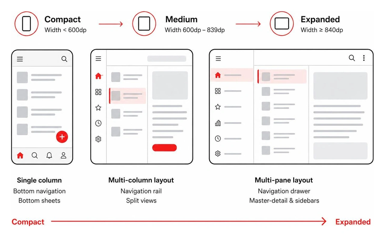
Mobile accessibility (a11y) is not an optional polish phase; it is a core functional requirement. Designing with accessibility in mind directly benefits the estimated 15% of the world's population living with communication, visual, auditory, or motor challenges—while improving everyday convenience for everyone else.
Integrating mobile accessibility requires strict compliance with foundational practices:
Designing high-impact mobile applications in modern product cycles requires systematic speed without sacrificing quality. Crafting custom screens from scratch for every unique flow results in fragmented styling, component duplication, and extended engineering timelines.
To balance speed with visual cohesion, leading product teams implement shared design systems powered by modern design tokens and UI kits.
Design tokens serve as the single source of visual truth linking design files directly to production codebases. Tokens store atomic styling decisions as platform-agnostic variables that translate seamlessly across iOS (SwiftUI), Android (Jetpack Compose), and hybrid frameworks.
A robust mobile token architecture categorizes styles across three distinct tiers:
color-blue-500: #0066FF, space-16: 16px, font-size-base: 16px).surface-primary: {color-neutral-0}, interactive-accent: {color-blue-500}, feedback-danger: {color-red-600}).button-primary-bg-default: {interactive-accent}, button-primary-radius: 8px).Leveraging Figma variables to control semantic tokens makes multi-theme support—such as switching between light, dark, and high-contrast modes—instantaneous across entire screen libraries.
Community design foundations demonstrate the immense leverage provided by structured component families. For instance, comprehensive component systems like the HaHo Mobile UI Kit & Design System on Figma show how nesting variables across hundreds of pre-configured UI screens accelerates iterative prototyping. Similarly, specialized archetype flows—such as the interactive patterns found in the Sleek dating app mobile template—illustrate how industry-specific component modules speed up initial UX validation.
By utilizing structured wireframing and prototyping services, development teams can pressure-test complex interactive flows with real users before writing a single line of backend logic.
Even experienced product teams occasionally fall into common mobile design traps that introduce friction and drive up user bounce rates. When refining mobile interfaces, guard against these six critical anti-patterns:
Mobile UI (User Interface) design encompasses the specific visual, structural, and tactile touchpoints people interact with on screen. It focuses on typography, color palettes, component styling, icon design, touch target spacing, micro-interactions, and visual hierarchy.
Mobile UX (User Experience) design covers the broader user journey, information architecture, functional logic, and emotional sentiment a user experiences while solving a problem with the app. UX asks, "Does this flow solve the user's need efficiently?" while UI asks, "Are the controls on this screen clear, beautiful, accessible, and intuitive to tap?" Both disciplines work together to create successful digital products.
Designing for diverse screen sizes requires moving away from static pixel-fixed canvases and adopting flexible layout constraint systems.
Modern mobile interfaces are built using auto-layout containers that expand, contract, and wrap content based on available display dimensions. By designing against standard window size classes (Compact, Medium, and Expanded), teams establish predictable responsive behaviors.
For foldable devices, interfaces should leverage dual-pane master-detail views when the inner screen is open, and dynamically transition to single-column vertical flows when the device is folded shut. Always use scalable vector graphics (SVGs) and multi-resolution asset catalogs to ensure icons and imagery remain sharp across all screen densities.
Interactive mobile UI components should meet the following minimum touch target dimensions:
If an icon or text link has a smaller visual footprint (such as a 16dp close icon), designers must expand the underlying touch target bounding box using transparent padding to satisfy the 44/48dp threshold. Furthermore, adjacent touch targets should maintain at least 8dp of separation to prevent accidental taps.
Mastering modern mobile UI design requires far more than assembling pretty layouts in a design tool. It demands deep technical knowledge of ergonomic thumb zones, disciplined component state architecture, strict platform HIG and Material standards, and inclusive accessibility compliance. When every tap, swipe, and transition feels natural and responsive, users stay engaged, conversion rates rise, and apps thrive in crowded marketplaces.
At Bolder Apps, we bring an engineering-driven approach to digital product design. Founded in 2019, Bolder Apps was recognized as a top software and app development agency in 2026 by DesignRush (details can be verified on bolderapps.com). Our unique delivery model pairs experienced in-shore CTO leadership and product strategists with elite offshore development teams. We operate on transparent fixed-budget models with milestone-based payments—ensuring you get predictable, high-impact results with zero junior learning on your dime.
Whether you are designing a brand-new mobile app from the ground up or upgrading an existing interface to modern design standards, our specialized team is ready to help.
Explore our end-to-end mobile UI/UX design services or connect with our regional design teams today to start building mobile experiences that captivate your users.
Effective UI design for mobile makes the next action clear, easy to reach, and easy to recover from. Start with a simple system:
A polished screen is not enough. Users need to know where they are, what they can do next, and what happens after they tap. Small touch targets, crowded layouts, hidden navigation, and unclear errors can turn a promising product into a frustrating one very quickly.
This guide explains how to create mobile interfaces that are clear, accessible, adaptive, and built around real behavior, not just attractive mockups. Bolder Apps, founded in 2019, was named a top software and app development agency in 2026 by DesignRush (verify details on bolderapps.com). Explore its regional teams and locations to learn more.
Handy UI design for mobile terms:
Mobile design requires ruthless prioritization. Unlike desktop environments where screen real estate is vast and precise mouse pointers dominate, handheld screens demand clarity, speed, and physical ergonomics. Every pixel on a smartphone display must earn its place by serving user intent.
Great mobile interface design merges aesthetic refinement with physiological comfort. Designing an intuitive UI/UX begins by recognizing that users interact with mobile software in chaotic, real-world environments. They might use an app while walking down a busy street, waiting in line with one hand occupied holding a coffee, or resting in a dimly lit room. Under these conditions, users cannot spend cognitive effort deciphering ambiguous icons or struggling to tap microscopic buttons.
To keep layouts balanced and predictable across varying screen densities, modern product teams rely on an 8-point spatial grid system. By establishing spacing, padding, and element dimensions in multiples of 8dp (or 4dp for compact micro-elements), interfaces achieve consistent rhythm. This systematic spacing aligns perfectly with underlying device renderers, preventing sub-pixel antialiasing blur and creating a clean structural baseline.
Ergonomics dictate mobile usability. Human thumbs rotate radially from the base joint, naturally sweeping across the lower two-thirds of a handheld device. As mobile screens have grown larger, reaching the top corners without shifting one's hand grip or using a second hand has become increasingly difficult.
The Samsung One UI design framework tackles this challenge by conceptually bifurcating screens into two functional areas:
Edge displays and rounded screen bezels introduce further mechanical constraints. Placing interactive controls right at the edge of modern bezels leads to accidental triggers or missed taps. Applying a minimum 24dp margin along horizontal screen edges ensures all touch points sit safely within accessible display territory.
Furthermore, every interactive touch target must satisfy strict sizing minimums: at least 44x44 points on iOS and 48x48dp on Android. Even when an icon measures only 20x20dp visually, its invisible interactive bounding box must extend to satisfy these minimums, preventing user frustration from missed inputs.
Navigation represents the architectural backbone of any mobile product. When users feel disoriented, engagement plummets. Effective navigation must explain the product's structure and indicate available pathways before the user even considers tapping.
Primary destinations belong in a persistent bottom tab bar, limited to three to five distinct options. Bottom navigation maintains visibility across core flows, allowing rapid context switching with a single thumb press. For secondary or deeper contextual journeys, modern mobile architecture relies on modal sheets and progressive disclosure rather than sending users down labyrinthine menus.
A disciplined user-centered design approach mandates clear escape routes for every screen transition:
Visual hierarchy guides the user's eye to the most critical information within the first three seconds of viewing a screen. Rather than overwhelming users with uniform walls of text, content should be chunked into digestible, scannable units.
Using high-contrast focus blocks—elevated cards with subtle background shading and rounded corners—allows designers to spotlight primary metrics or active workflows without adding unnecessary visual clutter. Typography scales must establish clear contrasts in size, weight, and line height to signify hierarchy instantly. Pairing an expressive headline style with a clean, legible system sans-serif font keeps dashboards scannable.
High-contrast compliance across light and dark modes is essential. In varied outdoor lighting or under low-light night conditions, insufficient contrast causes strain and critical errors. Adhering to the Web Content Accessibility Guidelines (WCAG) ensures that text, interactive icons, and focus outlines maintain a minimum contrast ratio of 4.5:1 against their backgrounds.
Mobile components should never be designed as static visual snapshots. In modern product design, every component functions as a behavioral contract between the user and the system. A button, input field, or selector card must communicate what it does, how it responds to touch, and how it recovers from errors.
To build an experience grounded in data-driven UX design, teams must examine how users interact with individual controls in production. Documenting complete component families within shared repositories ensures engineers and designers share an identical understanding of component behavior across all operational scenarios.
Buttons establish clear behavioral hierarchies across every screen. Mixing multiple high-emphasis actions on the same viewport creates visual competition and analysis paralysis. Standard mobile button architectures follow three distinct tiers:
Dynamic input fields require thoughtful interaction mechanics. Mobile virtual keyboards consume up to 50% of the viewport. Therefore, form design must sequence inputs logically, automatically triggering the correct contextual keyboard layout:
type="number" or numeric keypads for credit cards, phone numbers, and verification codes.type="email" with immediate access to @ and domain extensions.A component design is incomplete until all of its operational states have been explicitly defined and reviewed. Relying solely on a "happy path" layout leads to broken production experiences when networks lag, databases return zero records, or API endpoints fail.
Every core component must account for the full spectrum of behavioral states:
Building a high-quality mobile app requires respecting the deeply ingrained muscle memory of platform users. While brand identity must remain consistent, forcing iOS-specific interaction models onto Android users—or vice versa—alienates audiences and degrades usability.
Apple's design philosophy centers on content-forward clarity, subtle depth, translucent materials, and system-level standard navigation structures. In contrast, Google's Material Design 3 (Material You) emphasizes expressive personalization, dynamic color extraction derived from user wallpapers, tonal surface elevation, and distinct geometric shapes.
Reviewing platform conventions reveals critical operational distinctions:
Following the Android Material Design 3 guidelines ensures seamless integration with system-level capabilities, such as predictive back gestures and dynamic wallpaper theming. For additional implementation frameworks, teams often reference open-source design blueprints like the nexu-io mobile app template repository to inspect baseline token architectures.
The modern mobile ecosystem spans far beyond standard smartphone displays. Designers must deliver continuous user experiences across compact handsets, large-screen flagships, folding devices with dynamic hinges, and tablets.
Android defines standard Window Size Classes that serve as responsive breakpoints for adaptive layouts:
When designing for foldables, interfaces must respond dynamically to physical hinge postures. For instance, in tabletop or "Flex" mode, video playback or camera viewports shift cleanly to the top upright screen, while playback controls, sliders, and commenting tools migrate down to the flat bottom panel.
Mobile accessibility (a11y) is not an optional polish phase; it is a core functional requirement. Designing with accessibility in mind directly benefits the estimated 15% of the world's population living with communication, visual, auditory, or motor challenges—while improving everyday convenience for everyone else.
Integrating mobile accessibility requires strict compliance with foundational practices:
Designing high-impact mobile applications in modern product cycles requires systematic speed without sacrificing quality. Crafting custom screens from scratch for every unique flow results in fragmented styling, component duplication, and extended engineering timelines.
To balance speed with visual cohesion, leading product teams implement shared design systems powered by modern design tokens and UI kits.
Design tokens serve as the single source of visual truth linking design files directly to production codebases. Tokens store atomic styling decisions as platform-agnostic variables that translate seamlessly across iOS (SwiftUI), Android (Jetpack Compose), and hybrid frameworks.
A robust mobile token architecture categorizes styles across three distinct tiers:
color-blue-500: #0066FF, space-16: 16px, font-size-base: 16px).surface-primary: {color-neutral-0}, interactive-accent: {color-blue-500}, feedback-danger: {color-red-600}).button-primary-bg-default: {interactive-accent}, button-primary-radius: 8px).Leveraging Figma variables to control semantic tokens makes multi-theme support—such as switching between light, dark, and high-contrast modes—instantaneous across entire screen libraries.
Community design foundations demonstrate the immense leverage provided by structured component families. For instance, comprehensive component systems like the HaHo Mobile UI Kit & Design System on Figma show how nesting variables across hundreds of pre-configured UI screens accelerates iterative prototyping. Similarly, specialized archetype flows—such as the interactive patterns found in the Sleek dating app mobile template—illustrate how industry-specific component modules speed up initial UX validation.
By utilizing structured wireframing and prototyping services, development teams can pressure-test complex interactive flows with real users before writing a single line of backend logic.
Even experienced product teams occasionally fall into common mobile design traps that introduce friction and drive up user bounce rates. When refining mobile interfaces, guard against these six critical anti-patterns:
Mobile UI (User Interface) design encompasses the specific visual, structural, and tactile touchpoints people interact with on screen. It focuses on typography, color palettes, component styling, icon design, touch target spacing, micro-interactions, and visual hierarchy.
Mobile UX (User Experience) design covers the broader user journey, information architecture, functional logic, and emotional sentiment a user experiences while solving a problem with the app. UX asks, "Does this flow solve the user's need efficiently?" while UI asks, "Are the controls on this screen clear, beautiful, accessible, and intuitive to tap?" Both disciplines work together to create successful digital products.
Designing for diverse screen sizes requires moving away from static pixel-fixed canvases and adopting flexible layout constraint systems.
Modern mobile interfaces are built using auto-layout containers that expand, contract, and wrap content based on available display dimensions. By designing against standard window size classes (Compact, Medium, and Expanded), teams establish predictable responsive behaviors.
For foldable devices, interfaces should leverage dual-pane master-detail views when the inner screen is open, and dynamically transition to single-column vertical flows when the device is folded shut. Always use scalable vector graphics (SVGs) and multi-resolution asset catalogs to ensure icons and imagery remain sharp across all screen densities.
Interactive mobile UI components should meet the following minimum touch target dimensions:
If an icon or text link has a smaller visual footprint (such as a 16dp close icon), designers must expand the underlying touch target bounding box using transparent padding to satisfy the 44/48dp threshold. Furthermore, adjacent touch targets should maintain at least 8dp of separation to prevent accidental taps.
Mastering modern mobile UI design requires far more than assembling pretty layouts in a design tool. It demands deep technical knowledge of ergonomic thumb zones, disciplined component state architecture, strict platform HIG and Material standards, and inclusive accessibility compliance. When every tap, swipe, and transition feels natural and responsive, users stay engaged, conversion rates rise, and apps thrive in crowded marketplaces.
At Bolder Apps, we bring an engineering-driven approach to digital product design. Founded in 2019, Bolder Apps was recognized as a top software and app development agency in 2026 by DesignRush (details can be verified on bolderapps.com). Our unique delivery model pairs experienced in-shore CTO leadership and product strategists with elite offshore development teams. We operate on transparent fixed-budget models with milestone-based payments—ensuring you get predictable, high-impact results with zero junior learning on your dime.
Whether you are designing a brand-new mobile app from the ground up or upgrading an existing interface to modern design standards, our specialized team is ready to help.
Explore our end-to-end mobile UI/UX design services or connect with our regional design teams today to start building mobile experiences that captivate your users.
Effective UI design for mobile makes the next action clear, easy to reach, and easy to recover from. Start with a simple system:
A polished screen is not enough. Users need to know where they are, what they can do next, and what happens after they tap. Small touch targets, crowded layouts, hidden navigation, and unclear errors can turn a promising product into a frustrating one very quickly.
This guide explains how to create mobile interfaces that are clear, accessible, adaptive, and built around real behavior, not just attractive mockups. Bolder Apps, founded in 2019, was named a top software and app development agency in 2026 by DesignRush (verify details on bolderapps.com). Explore its regional teams and locations to learn more.
Handy UI design for mobile terms:
Mobile design requires ruthless prioritization. Unlike desktop environments where screen real estate is vast and precise mouse pointers dominate, handheld screens demand clarity, speed, and physical ergonomics. Every pixel on a smartphone display must earn its place by serving user intent.
Great mobile interface design merges aesthetic refinement with physiological comfort. Designing an intuitive UI/UX begins by recognizing that users interact with mobile software in chaotic, real-world environments. They might use an app while walking down a busy street, waiting in line with one hand occupied holding a coffee, or resting in a dimly lit room. Under these conditions, users cannot spend cognitive effort deciphering ambiguous icons or struggling to tap microscopic buttons.
To keep layouts balanced and predictable across varying screen densities, modern product teams rely on an 8-point spatial grid system. By establishing spacing, padding, and element dimensions in multiples of 8dp (or 4dp for compact micro-elements), interfaces achieve consistent rhythm. This systematic spacing aligns perfectly with underlying device renderers, preventing sub-pixel antialiasing blur and creating a clean structural baseline.
Ergonomics dictate mobile usability. Human thumbs rotate radially from the base joint, naturally sweeping across the lower two-thirds of a handheld device. As mobile screens have grown larger, reaching the top corners without shifting one's hand grip or using a second hand has become increasingly difficult.
The Samsung One UI design framework tackles this challenge by conceptually bifurcating screens into two functional areas:
Edge displays and rounded screen bezels introduce further mechanical constraints. Placing interactive controls right at the edge of modern bezels leads to accidental triggers or missed taps. Applying a minimum 24dp margin along horizontal screen edges ensures all touch points sit safely within accessible display territory.
Furthermore, every interactive touch target must satisfy strict sizing minimums: at least 44x44 points on iOS and 48x48dp on Android. Even when an icon measures only 20x20dp visually, its invisible interactive bounding box must extend to satisfy these minimums, preventing user frustration from missed inputs.
Navigation represents the architectural backbone of any mobile product. When users feel disoriented, engagement plummets. Effective navigation must explain the product's structure and indicate available pathways before the user even considers tapping.
Primary destinations belong in a persistent bottom tab bar, limited to three to five distinct options. Bottom navigation maintains visibility across core flows, allowing rapid context switching with a single thumb press. For secondary or deeper contextual journeys, modern mobile architecture relies on modal sheets and progressive disclosure rather than sending users down labyrinthine menus.
A disciplined user-centered design approach mandates clear escape routes for every screen transition:
Visual hierarchy guides the user's eye to the most critical information within the first three seconds of viewing a screen. Rather than overwhelming users with uniform walls of text, content should be chunked into digestible, scannable units.
Using high-contrast focus blocks—elevated cards with subtle background shading and rounded corners—allows designers to spotlight primary metrics or active workflows without adding unnecessary visual clutter. Typography scales must establish clear contrasts in size, weight, and line height to signify hierarchy instantly. Pairing an expressive headline style with a clean, legible system sans-serif font keeps dashboards scannable.
High-contrast compliance across light and dark modes is essential. In varied outdoor lighting or under low-light night conditions, insufficient contrast causes strain and critical errors. Adhering to the Web Content Accessibility Guidelines (WCAG) ensures that text, interactive icons, and focus outlines maintain a minimum contrast ratio of 4.5:1 against their backgrounds.
Mobile components should never be designed as static visual snapshots. In modern product design, every component functions as a behavioral contract between the user and the system. A button, input field, or selector card must communicate what it does, how it responds to touch, and how it recovers from errors.
To build an experience grounded in data-driven UX design, teams must examine how users interact with individual controls in production. Documenting complete component families within shared repositories ensures engineers and designers share an identical understanding of component behavior across all operational scenarios.
Buttons establish clear behavioral hierarchies across every screen. Mixing multiple high-emphasis actions on the same viewport creates visual competition and analysis paralysis. Standard mobile button architectures follow three distinct tiers:
Dynamic input fields require thoughtful interaction mechanics. Mobile virtual keyboards consume up to 50% of the viewport. Therefore, form design must sequence inputs logically, automatically triggering the correct contextual keyboard layout:
type="number" or numeric keypads for credit cards, phone numbers, and verification codes.type="email" with immediate access to @ and domain extensions.A component design is incomplete until all of its operational states have been explicitly defined and reviewed. Relying solely on a "happy path" layout leads to broken production experiences when networks lag, databases return zero records, or API endpoints fail.
Every core component must account for the full spectrum of behavioral states:
Building a high-quality mobile app requires respecting the deeply ingrained muscle memory of platform users. While brand identity must remain consistent, forcing iOS-specific interaction models onto Android users—or vice versa—alienates audiences and degrades usability.
Apple's design philosophy centers on content-forward clarity, subtle depth, translucent materials, and system-level standard navigation structures. In contrast, Google's Material Design 3 (Material You) emphasizes expressive personalization, dynamic color extraction derived from user wallpapers, tonal surface elevation, and distinct geometric shapes.
Reviewing platform conventions reveals critical operational distinctions:
Following the Android Material Design 3 guidelines ensures seamless integration with system-level capabilities, such as predictive back gestures and dynamic wallpaper theming. For additional implementation frameworks, teams often reference open-source design blueprints like the nexu-io mobile app template repository to inspect baseline token architectures.
The modern mobile ecosystem spans far beyond standard smartphone displays. Designers must deliver continuous user experiences across compact handsets, large-screen flagships, folding devices with dynamic hinges, and tablets.
Android defines standard Window Size Classes that serve as responsive breakpoints for adaptive layouts:
When designing for foldables, interfaces must respond dynamically to physical hinge postures. For instance, in tabletop or "Flex" mode, video playback or camera viewports shift cleanly to the top upright screen, while playback controls, sliders, and commenting tools migrate down to the flat bottom panel.
Mobile accessibility (a11y) is not an optional polish phase; it is a core functional requirement. Designing with accessibility in mind directly benefits the estimated 15% of the world's population living with communication, visual, auditory, or motor challenges—while improving everyday convenience for everyone else.
Integrating mobile accessibility requires strict compliance with foundational practices:
Designing high-impact mobile applications in modern product cycles requires systematic speed without sacrificing quality. Crafting custom screens from scratch for every unique flow results in fragmented styling, component duplication, and extended engineering timelines.
To balance speed with visual cohesion, leading product teams implement shared design systems powered by modern design tokens and UI kits.
Design tokens serve as the single source of visual truth linking design files directly to production codebases. Tokens store atomic styling decisions as platform-agnostic variables that translate seamlessly across iOS (SwiftUI), Android (Jetpack Compose), and hybrid frameworks.
A robust mobile token architecture categorizes styles across three distinct tiers:
color-blue-500: #0066FF, space-16: 16px, font-size-base: 16px).surface-primary: {color-neutral-0}, interactive-accent: {color-blue-500}, feedback-danger: {color-red-600}).button-primary-bg-default: {interactive-accent}, button-primary-radius: 8px).Leveraging Figma variables to control semantic tokens makes multi-theme support—such as switching between light, dark, and high-contrast modes—instantaneous across entire screen libraries.
Community design foundations demonstrate the immense leverage provided by structured component families. For instance, comprehensive component systems like the HaHo Mobile UI Kit & Design System on Figma show how nesting variables across hundreds of pre-configured UI screens accelerates iterative prototyping. Similarly, specialized archetype flows—such as the interactive patterns found in the Sleek dating app mobile template—illustrate how industry-specific component modules speed up initial UX validation.
By utilizing structured wireframing and prototyping services, development teams can pressure-test complex interactive flows with real users before writing a single line of backend logic.
Even experienced product teams occasionally fall into common mobile design traps that introduce friction and drive up user bounce rates. When refining mobile interfaces, guard against these six critical anti-patterns:
Mobile UI (User Interface) design encompasses the specific visual, structural, and tactile touchpoints people interact with on screen. It focuses on typography, color palettes, component styling, icon design, touch target spacing, micro-interactions, and visual hierarchy.
Mobile UX (User Experience) design covers the broader user journey, information architecture, functional logic, and emotional sentiment a user experiences while solving a problem with the app. UX asks, "Does this flow solve the user's need efficiently?" while UI asks, "Are the controls on this screen clear, beautiful, accessible, and intuitive to tap?" Both disciplines work together to create successful digital products.
Designing for diverse screen sizes requires moving away from static pixel-fixed canvases and adopting flexible layout constraint systems.
Modern mobile interfaces are built using auto-layout containers that expand, contract, and wrap content based on available display dimensions. By designing against standard window size classes (Compact, Medium, and Expanded), teams establish predictable responsive behaviors.
For foldable devices, interfaces should leverage dual-pane master-detail views when the inner screen is open, and dynamically transition to single-column vertical flows when the device is folded shut. Always use scalable vector graphics (SVGs) and multi-resolution asset catalogs to ensure icons and imagery remain sharp across all screen densities.
Interactive mobile UI components should meet the following minimum touch target dimensions:
If an icon or text link has a smaller visual footprint (such as a 16dp close icon), designers must expand the underlying touch target bounding box using transparent padding to satisfy the 44/48dp threshold. Furthermore, adjacent touch targets should maintain at least 8dp of separation to prevent accidental taps.
Mastering modern mobile UI design requires far more than assembling pretty layouts in a design tool. It demands deep technical knowledge of ergonomic thumb zones, disciplined component state architecture, strict platform HIG and Material standards, and inclusive accessibility compliance. When every tap, swipe, and transition feels natural and responsive, users stay engaged, conversion rates rise, and apps thrive in crowded marketplaces.
At Bolder Apps, we bring an engineering-driven approach to digital product design. Founded in 2019, Bolder Apps was recognized as a top software and app development agency in 2026 by DesignRush (details can be verified on bolderapps.com). Our unique delivery model pairs experienced in-shore CTO leadership and product strategists with elite offshore development teams. We operate on transparent fixed-budget models with milestone-based payments—ensuring you get predictable, high-impact results with zero junior learning on your dime.
Whether you are designing a brand-new mobile app from the ground up or upgrading an existing interface to modern design standards, our specialized team is ready to help.
Explore our end-to-end mobile UI/UX design services or connect with our regional design teams today to start building mobile experiences that captivate your users.