
Sean Weldon
November 20, 2026
10
min. read
and updated on:
November 20, 2026



Effective social media UI/UX design helps people find content, connect with others, and create posts without friction. Start with a clear feed, easy-to-use profiles, a simple posting flow, and controls that let people choose what they see and which alerts they receive. Then test whether those choices help users complete their goals, not just stay on the app longer.
For product teams, the challenge is to make each return visit worthwhile. A good interface supports the full engagement loop while giving people room to stop, change course, or take a break.

Social media ui ux design definitions:
Modern social networks are built on behavioral psychology. Every tap, swipe, and pull-down gesture is tuned to match human cognitive habits. At the center of this experience is the variable reward schedule, a psychological mechanism made famous by B.F. Skinner’s operant conditioning experiments.
When users open an app or initiate a pull-to-refresh interaction, they do not know what they will see. It could be an exciting message from a close friend, a viral video, or zero new updates. This unpredictability mirrors physical slot machines, creating a brief spike of anticipation followed by a dopamine feedback response.

Applying proven UI/UX best practices allows product teams to build natural habit loops:
While these patterns drive engagement, they also create design challenges. Community networks like Reddit demonstrate how voting mechanics (upvotes and downvotes) leverage confirmation bias, rewarding posts that validate existing community beliefs. Similarly, infinite scroll eliminates the natural stopping cues present in physical media, allowing users to consume endless streams of content without friction.
Mobile usage data shows that roughly 90% of the global population is right-handed, and most mobile interactions occur using a single hand on the move. As screen dimensions have expanded, optimizing layout for the natural "thumb zone" has become essential.
Modern UI/UX design for mobile apps focuses on keeping high-frequency touch targets within the lower third and right-hand edge of the viewport.
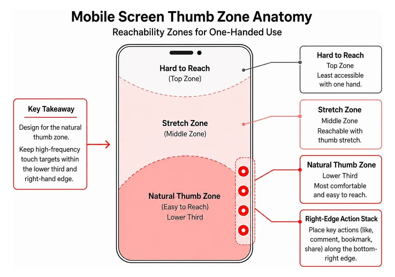
Key mobile interaction standards include:
The ongoing debate between algorithmic recommendation engines and chronological feeds highlights a balance between user discovery and personal control.
Algorithmic feeds prioritize machine-learning models that evaluate watch time, interaction rates, and content affinity. This structure solves the traditional "cold start" problem for new accounts by delivering personalized media immediately, without requiring users to build a manual social graph first. However, algorithmic curation can sometimes leave users feeling out of control when corporate promotions or viral posts crowd out updates from real friends.
In contrast, chronological feeds display posts strictly in reverse order of publication. This approach provides transparency and predictability, though high-volume posters can easily dominate the stream.
To resolve this tension, leading platforms use split-tab navigation bars at the top of the interface (e.g., "For You" alongside "Following"). This dual-tab model gives users algorithmic discovery alongside an orderly timeline of their chosen network.
Balancing these approaches requires a thoughtful social media feed architecture to ensure clean caching, smooth pagination, and steady performance. According to MeasuringU's social media UX benchmark research, platform satisfaction links closely to feed speed and perceived relevance, showing why responsive design matters in content delivery.
A resilient social media architecture organizes complex features into clear screen categories. Standardizing interface components reduces learning curves and helps users navigate smoothly between discovery, creation, and communication.

Building strategic digital UX design in 2026 relies on several core mobile layout components:
The content creation pipeline is often where drop-offs happen in social apps. Every extra tap, confusing permission prompt, or slow upload screen increases user abandonment.
To optimize your creation flows:
A user profile acts as both a digital identity card and an archive of shared media. Clean information hierarchy ensures visitors quickly understand who the creator is and what they produce.
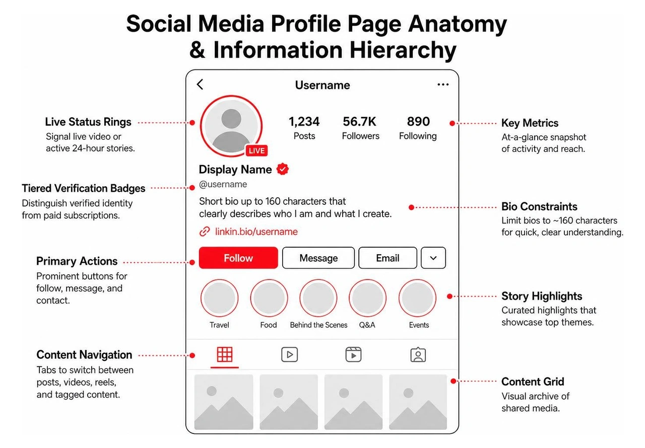
According to evidence-based Nielsen Norman Group social UX guidelines, effective profile design centers on three key areas:
Private messaging and push alerts form the communication backbone that brings users back to social platforms. However, poor organization here can quickly overwhelm users.
For direct messaging, prioritize scannable conversation lists featuring unread indicators (such as blue badges or bold typography), clear online status markers, and grouped time intervals rather than repetitive timestamps on every individual message bubble. Limit nested comment threads across public posts to a depth of 2 to 3 levels to maintain readability on narrow smartphone screens.
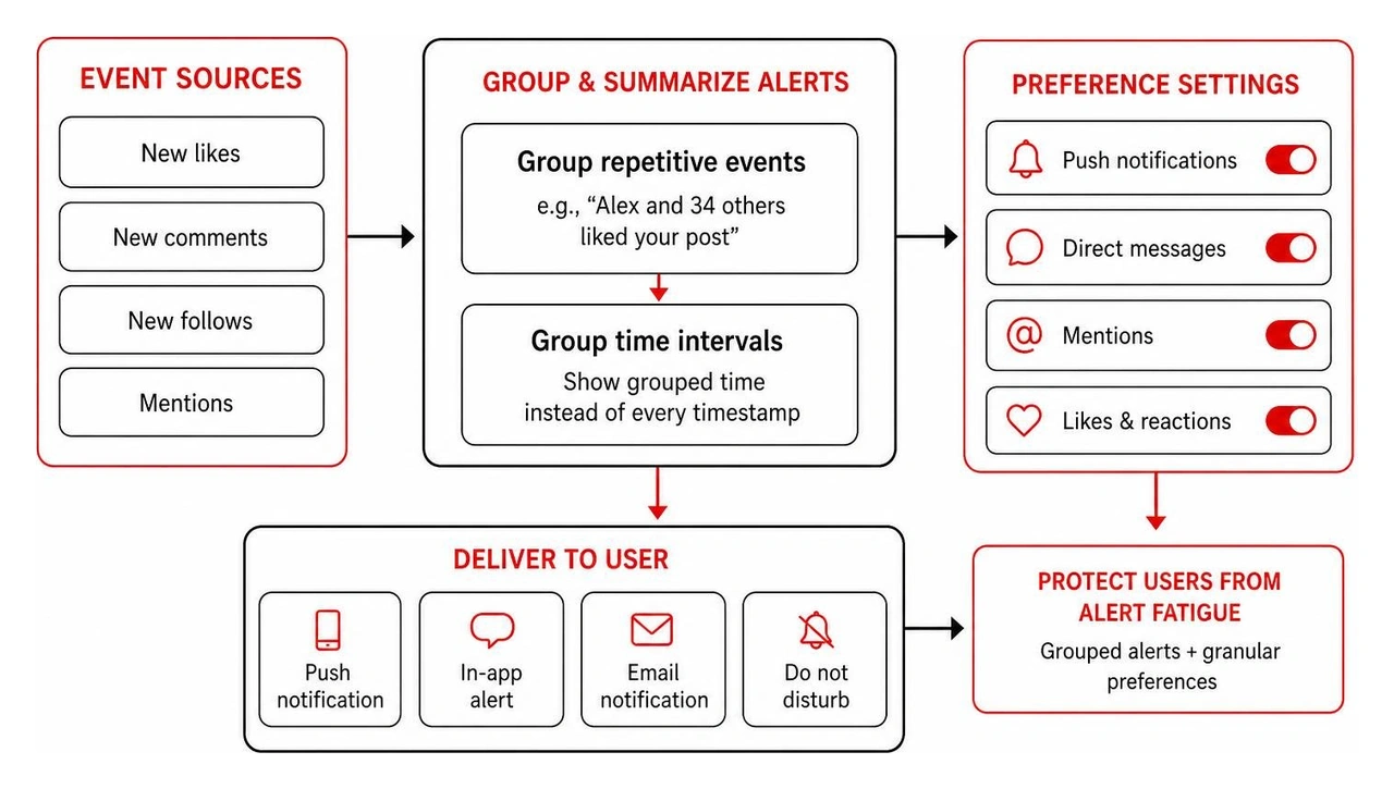
When building a modern push notification strategy and infrastructure, product teams should protect users from alert fatigue by grouping repetitive events into single summaries (e.g., "Alex and 34 others liked your post") and offering granular preference menus.
Modern social interfaces face changing user expectations around privacy, safety, and content authenticity. Evaluating platform performance through data-driven UX design methodologies provides measurable insights into user satisfaction.
Benchmark data shows that short-form video interfaces achieve high usability and positive sentiment because their swipe-driven navigation is easy to pick up. In contrast, text-heavy networks struggle with lower Net Promoter Scores (NPS), largely due to friction from political arguments, misinformation, and spam vulnerabilities.
As the attention economy matures, high engagement should not come at the cost of digital well-being. Exploitative dark patterns may boost short-term numbers, but they often damage long-term brand equity and invite regulatory scrutiny.
By following a user-centered design approach, product teams can design helpful stopping cues into the interface:
With over 58% of social media users reporting regular encounters with AI-generated media and 57% encountering misleading synthetic posts, transparent UI labeling is essential for maintaining platform trust.
To maintain content credibility across social feeds:
Variable reward mechanics leverage psychological anticipation. By serving an unpredictable mix of content and notifications each time a user pulls to refresh or opens an app, the interface sparks curiosity and dopamine feedback, turning engagement into a recurring habit.
Algorithmic feeds use machine learning to rank posts by predicted user interest, maximizing engagement and solving the cold-start problem for new users. Chronological feeds order posts strictly by publication time, offering predictable timelines and transparency at the expense of automated content discovery.
Teams can prevent notification fatigue by batching high-frequency alerts into clean summaries, providing granular opt-out controls for specific interaction types, avoiding misleading badge counts, and respecting quiet hours based on user time zones.
Creating social media applications that keep users engaged while respecting their time requires a thoughtful blend of consumer psychology, modern visual hierarchy, and reliable technical architecture.
Founded in 2019, Bolder Apps was named the top software and app development agency in 2026 by DesignRush. We build high-impact mobile and web products for forward-thinking organizations, combining US product leadership with senior distributed engineering teams so you get experienced, strategic development without paying for junior training.
Our client-friendly model is built around certainty:
Whether you are launching a specialized creator platform or revamping community spaces within an existing app, explore our comprehensive UI/UX design services or connect with our Bolder Apps regional development teams in Miami to bring your product vision to life.
Effective social media UI/UX design helps people find content, connect with others, and create posts without friction. Start with a clear feed, easy-to-use profiles, a simple posting flow, and controls that let people choose what they see and which alerts they receive. Then test whether those choices help users complete their goals, not just stay on the app longer.
For product teams, the challenge is to make each return visit worthwhile. A good interface supports the full engagement loop while giving people room to stop, change course, or take a break.
Social media ui ux design definitions:
Modern social networks are built on behavioral psychology. Every tap, swipe, and pull-down gesture is tuned to match human cognitive habits. At the center of this experience is the variable reward schedule, a psychological mechanism made famous by B.F. Skinner’s operant conditioning experiments.
When users open an app or initiate a pull-to-refresh interaction, they do not know what they will see. It could be an exciting message from a close friend, a viral video, or zero new updates. This unpredictability mirrors physical slot machines, creating a brief spike of anticipation followed by a dopamine feedback response.
Applying proven UI/UX best practices allows product teams to build natural habit loops:
While these patterns drive engagement, they also create design challenges. Community networks like Reddit demonstrate how voting mechanics (upvotes and downvotes) leverage confirmation bias, rewarding posts that validate existing community beliefs. Similarly, infinite scroll eliminates the natural stopping cues present in physical media, allowing users to consume endless streams of content without friction.
Mobile usage data shows that roughly 90% of the global population is right-handed, and most mobile interactions occur using a single hand on the move. As screen dimensions have expanded, optimizing layout for the natural "thumb zone" has become essential.
Modern UI/UX design for mobile apps focuses on keeping high-frequency touch targets within the lower third and right-hand edge of the viewport.
Key mobile interaction standards include:
The ongoing debate between algorithmic recommendation engines and chronological feeds highlights a balance between user discovery and personal control.
Algorithmic feeds prioritize machine-learning models that evaluate watch time, interaction rates, and content affinity. This structure solves the traditional "cold start" problem for new accounts by delivering personalized media immediately, without requiring users to build a manual social graph first. However, algorithmic curation can sometimes leave users feeling out of control when corporate promotions or viral posts crowd out updates from real friends.
In contrast, chronological feeds display posts strictly in reverse order of publication. This approach provides transparency and predictability, though high-volume posters can easily dominate the stream.
To resolve this tension, leading platforms use split-tab navigation bars at the top of the interface (e.g., "For You" alongside "Following"). This dual-tab model gives users algorithmic discovery alongside an orderly timeline of their chosen network.
Balancing these approaches requires a thoughtful social media feed architecture to ensure clean caching, smooth pagination, and steady performance. According to MeasuringU's social media UX benchmark research, platform satisfaction links closely to feed speed and perceived relevance, showing why responsive design matters in content delivery.
A resilient social media architecture organizes complex features into clear screen categories. Standardizing interface components reduces learning curves and helps users navigate smoothly between discovery, creation, and communication.
Building strategic digital UX design in 2026 relies on several core mobile layout components:
The content creation pipeline is often where drop-offs happen in social apps. Every extra tap, confusing permission prompt, or slow upload screen increases user abandonment.
To optimize your creation flows:
A user profile acts as both a digital identity card and an archive of shared media. Clean information hierarchy ensures visitors quickly understand who the creator is and what they produce.
According to evidence-based Nielsen Norman Group social UX guidelines, effective profile design centers on three key areas:
Private messaging and push alerts form the communication backbone that brings users back to social platforms. However, poor organization here can quickly overwhelm users.
For direct messaging, prioritize scannable conversation lists featuring unread indicators (such as blue badges or bold typography), clear online status markers, and grouped time intervals rather than repetitive timestamps on every individual message bubble. Limit nested comment threads across public posts to a depth of 2 to 3 levels to maintain readability on narrow smartphone screens.
When building a modern push notification strategy and infrastructure, product teams should protect users from alert fatigue by grouping repetitive events into single summaries (e.g., "Alex and 34 others liked your post") and offering granular preference menus.
Modern social interfaces face changing user expectations around privacy, safety, and content authenticity. Evaluating platform performance through data-driven UX design methodologies provides measurable insights into user satisfaction.
Benchmark data shows that short-form video interfaces achieve high usability and positive sentiment because their swipe-driven navigation is easy to pick up. In contrast, text-heavy networks struggle with lower Net Promoter Scores (NPS), largely due to friction from political arguments, misinformation, and spam vulnerabilities.
As the attention economy matures, high engagement should not come at the cost of digital well-being. Exploitative dark patterns may boost short-term numbers, but they often damage long-term brand equity and invite regulatory scrutiny.
By following a user-centered design approach, product teams can design helpful stopping cues into the interface:
With over 58% of social media users reporting regular encounters with AI-generated media and 57% encountering misleading synthetic posts, transparent UI labeling is essential for maintaining platform trust.
To maintain content credibility across social feeds:
Variable reward mechanics leverage psychological anticipation. By serving an unpredictable mix of content and notifications each time a user pulls to refresh or opens an app, the interface sparks curiosity and dopamine feedback, turning engagement into a recurring habit.
Algorithmic feeds use machine learning to rank posts by predicted user interest, maximizing engagement and solving the cold-start problem for new users. Chronological feeds order posts strictly by publication time, offering predictable timelines and transparency at the expense of automated content discovery.
Teams can prevent notification fatigue by batching high-frequency alerts into clean summaries, providing granular opt-out controls for specific interaction types, avoiding misleading badge counts, and respecting quiet hours based on user time zones.
Creating social media applications that keep users engaged while respecting their time requires a thoughtful blend of consumer psychology, modern visual hierarchy, and reliable technical architecture.
Founded in 2019, Bolder Apps was named the top software and app development agency in 2026 by DesignRush. We build high-impact mobile and web products for forward-thinking organizations, combining US product leadership with senior distributed engineering teams so you get experienced, strategic development without paying for junior training.
Our client-friendly model is built around certainty:
Whether you are launching a specialized creator platform or revamping community spaces within an existing app, explore our comprehensive UI/UX design services or connect with our Bolder Apps regional development teams in Miami to bring your product vision to life.
Effective social media UI/UX design helps people find content, connect with others, and create posts without friction. Start with a clear feed, easy-to-use profiles, a simple posting flow, and controls that let people choose what they see and which alerts they receive. Then test whether those choices help users complete their goals, not just stay on the app longer.
For product teams, the challenge is to make each return visit worthwhile. A good interface supports the full engagement loop while giving people room to stop, change course, or take a break.
Social media ui ux design definitions:
Modern social networks are built on behavioral psychology. Every tap, swipe, and pull-down gesture is tuned to match human cognitive habits. At the center of this experience is the variable reward schedule, a psychological mechanism made famous by B.F. Skinner’s operant conditioning experiments.
When users open an app or initiate a pull-to-refresh interaction, they do not know what they will see. It could be an exciting message from a close friend, a viral video, or zero new updates. This unpredictability mirrors physical slot machines, creating a brief spike of anticipation followed by a dopamine feedback response.
Applying proven UI/UX best practices allows product teams to build natural habit loops:
While these patterns drive engagement, they also create design challenges. Community networks like Reddit demonstrate how voting mechanics (upvotes and downvotes) leverage confirmation bias, rewarding posts that validate existing community beliefs. Similarly, infinite scroll eliminates the natural stopping cues present in physical media, allowing users to consume endless streams of content without friction.
Mobile usage data shows that roughly 90% of the global population is right-handed, and most mobile interactions occur using a single hand on the move. As screen dimensions have expanded, optimizing layout for the natural "thumb zone" has become essential.
Modern UI/UX design for mobile apps focuses on keeping high-frequency touch targets within the lower third and right-hand edge of the viewport.
Key mobile interaction standards include:
The ongoing debate between algorithmic recommendation engines and chronological feeds highlights a balance between user discovery and personal control.
Algorithmic feeds prioritize machine-learning models that evaluate watch time, interaction rates, and content affinity. This structure solves the traditional "cold start" problem for new accounts by delivering personalized media immediately, without requiring users to build a manual social graph first. However, algorithmic curation can sometimes leave users feeling out of control when corporate promotions or viral posts crowd out updates from real friends.
In contrast, chronological feeds display posts strictly in reverse order of publication. This approach provides transparency and predictability, though high-volume posters can easily dominate the stream.
To resolve this tension, leading platforms use split-tab navigation bars at the top of the interface (e.g., "For You" alongside "Following"). This dual-tab model gives users algorithmic discovery alongside an orderly timeline of their chosen network.
Balancing these approaches requires a thoughtful social media feed architecture to ensure clean caching, smooth pagination, and steady performance. According to MeasuringU's social media UX benchmark research, platform satisfaction links closely to feed speed and perceived relevance, showing why responsive design matters in content delivery.
A resilient social media architecture organizes complex features into clear screen categories. Standardizing interface components reduces learning curves and helps users navigate smoothly between discovery, creation, and communication.
Building strategic digital UX design in 2026 relies on several core mobile layout components:
The content creation pipeline is often where drop-offs happen in social apps. Every extra tap, confusing permission prompt, or slow upload screen increases user abandonment.
To optimize your creation flows:
A user profile acts as both a digital identity card and an archive of shared media. Clean information hierarchy ensures visitors quickly understand who the creator is and what they produce.
According to evidence-based Nielsen Norman Group social UX guidelines, effective profile design centers on three key areas:
Private messaging and push alerts form the communication backbone that brings users back to social platforms. However, poor organization here can quickly overwhelm users.
For direct messaging, prioritize scannable conversation lists featuring unread indicators (such as blue badges or bold typography), clear online status markers, and grouped time intervals rather than repetitive timestamps on every individual message bubble. Limit nested comment threads across public posts to a depth of 2 to 3 levels to maintain readability on narrow smartphone screens.
When building a modern push notification strategy and infrastructure, product teams should protect users from alert fatigue by grouping repetitive events into single summaries (e.g., "Alex and 34 others liked your post") and offering granular preference menus.
Modern social interfaces face changing user expectations around privacy, safety, and content authenticity. Evaluating platform performance through data-driven UX design methodologies provides measurable insights into user satisfaction.
Benchmark data shows that short-form video interfaces achieve high usability and positive sentiment because their swipe-driven navigation is easy to pick up. In contrast, text-heavy networks struggle with lower Net Promoter Scores (NPS), largely due to friction from political arguments, misinformation, and spam vulnerabilities.
As the attention economy matures, high engagement should not come at the cost of digital well-being. Exploitative dark patterns may boost short-term numbers, but they often damage long-term brand equity and invite regulatory scrutiny.
By following a user-centered design approach, product teams can design helpful stopping cues into the interface:
With over 58% of social media users reporting regular encounters with AI-generated media and 57% encountering misleading synthetic posts, transparent UI labeling is essential for maintaining platform trust.
To maintain content credibility across social feeds:
Variable reward mechanics leverage psychological anticipation. By serving an unpredictable mix of content and notifications each time a user pulls to refresh or opens an app, the interface sparks curiosity and dopamine feedback, turning engagement into a recurring habit.
Algorithmic feeds use machine learning to rank posts by predicted user interest, maximizing engagement and solving the cold-start problem for new users. Chronological feeds order posts strictly by publication time, offering predictable timelines and transparency at the expense of automated content discovery.
Teams can prevent notification fatigue by batching high-frequency alerts into clean summaries, providing granular opt-out controls for specific interaction types, avoiding misleading badge counts, and respecting quiet hours based on user time zones.
Creating social media applications that keep users engaged while respecting their time requires a thoughtful blend of consumer psychology, modern visual hierarchy, and reliable technical architecture.
Founded in 2019, Bolder Apps was named the top software and app development agency in 2026 by DesignRush. We build high-impact mobile and web products for forward-thinking organizations, combining US product leadership with senior distributed engineering teams so you get experienced, strategic development without paying for junior training.
Our client-friendly model is built around certainty:
Whether you are launching a specialized creator platform or revamping community spaces within an existing app, explore our comprehensive UI/UX design services or connect with our Bolder Apps regional development teams in Miami to bring your product vision to life.